AI Anti-Patterns Gallery: 10 Reasons Your AI Website Looks Generic
A visual gallery of the 10 most common AI-generated design clichés, why they happen, and the specific rule you can add to your project rules to prevent each one.
Why AI output keeps producing the same 10 websites
Open any “AI-generated landing page” gallery and the recipe repeats: gradient hero, 3D blob, fade-in on scroll, three feature cards with circle icons, generic feature copy.
It is not that the models have bad taste. They have no taste until you give them yours.
Generic is not a style. It is the absence of rules. Every decision you do not make gets filled with the statistical average of the internet.
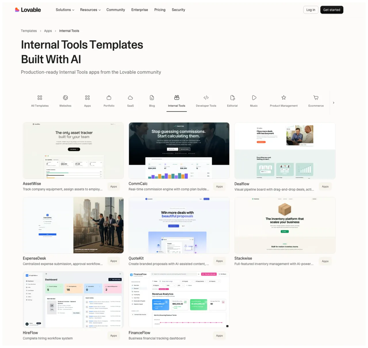
Some of the problem starts before the model even runs. If everyone in your category starts from the same Lovable template, the same v0 starter, or the same Figma Make remix, of course the outputs converge. The templates are not bad. They are just so widely used that “production-ready” has become “production-default”.
This gallery catalogs the 10 anti-patterns I see most often in AI-generated sites. Each entry shows what the pattern looks like, why the model probably produces it, and the exact rule you can paste into your project context to prevent it.
Use it as a calibration tool. The faster you can name a failure mode, the faster you can design a rule against it.
One frame before you start. These are anti-patterns because they are the model’s defaults, not because the design choices themselves are wrong. A luxury watchmaker using black + gold + serif is making a deliberate decision. The model handing you black + gold + serif because you typed “premium” is not. Read the patterns as defaults to override, not as bans.
How to read this gallery
Each anti-pattern has four parts:
- What it looks like. Visual description so you can recognize it
- Why the model produces it. The reason this pattern wins the statistical average
- Why it fails. What makes it feel generic instead of authored
- The rule. A paste-ready block for your
CLAUDE.md
At the bottom you get one combined anti-pattern block you can drop into your project.
1. Luxury by default
What it looks like: black backgrounds, oversized serif headlines, gold accents, heavy blur, glossy cards, “exclusive · refined · bespoke” word salad.
Why the model probably produces it: the word “premium” sits in the same statistical cluster as dark backgrounds, gold, and serifs across decades of training data. The model is giving you the average answer to a vague brief.
Why it fails: it looks expensive in theory and generic in practice. Real premium design is restraint. This is costume.
Premium through restraint: monochrome system language, exact spacing, quiet borders, and useful product detail. No gold, no serif costume, no luxury word salad.
The rule:
## When the brief says "premium" or "luxury"
- Premium does not mean dark mode with gold.
- Use restraint, rhythm, spacing, and confidence.
- Maximum 2 colors on the page. Accent colors are earned, not decorative.
- No gold (#d4af37, #c9a227, etc.). No matte-black gradients.
- No serif + gold + all-caps "EXCLUSIVE" combinations.
- Ask: what would feel premium if I removed 50% of the visual elements?
2. Gradient overload
What it looks like: every section has a gradient. Cards glow. Buttons glow. The background glows. Multiple unrelated color transitions on one screen.
Why the model probably produces it: gradients pattern-match strongly with words like “modern”, “vibrant”, “tech”, and “AI”. With no constraint, the model reaches for the strongest aesthetic association.
Why it fails: gradients stop functioning as emphasis when everything is emphasized. They flatten hierarchy instead of creating it.
Solid white background, black type, single accent in the data-viz only. Zero decorative gradients on buttons, cards, or backgrounds. The color does work, not decoration.
The rule:
## Gradients
- Maximum one gradient per page. Never on more than one element type.
- No gradient buttons. No gradient card backgrounds. No gradient text unless it is the only visual accent on the page.
- If you use a gradient, use exactly 2 colors from the approved palette. No rainbow.
- No glow effects. No box-shadows with colored blur above 4px.
3. Fake depth everywhere
What it looks like: giant shadows under every card. Layered glass panels. Floating objects with no compositional reason.
Why the model probably produces it: shadow-lg, glass, frosted, floating, elevated are all stylistic tokens associated with “polished” in the training data. With nothing to choose between them, the model stacks them.
Why it fails: depth becomes decoration instead of structure. It adds noise rather than spatial clarity.
Hero is pure flat type on a dark canvas. No shadowed cards, no glass panels, no floating planes. When depth appears later, it is a real customer site, used as content, not decoration.
The rule:
## Depth and shadows
- Cards: borders only (1px solid), no shadows by default.
- Shadows are only used to indicate temporary surfaces (dropdowns, modals, tooltips).
- Never stack multiple shadow layers on a single element.
- No glassmorphism. No backdrop-filter: blur. No frosted glass cards.
- If the design calls for depth, ask: "What hierarchy am I trying to signal?" Then pick one technique.
4. Random 3D hero syndrome
What it looks like: a sphere, cube, or floating abstract 3D object in the hero. Beautiful but disconnected imagery. No relationship between the asset and the product.
Why the model probably produces it: abstract 3D hero objects are heavily represented in the training data, from Dribbble shots to startup launches. It has become the new stock hero image.
Why it fails: it signals “AI made this” instead of “this website has a point of view.” The 3D asset is doing zero communication work.
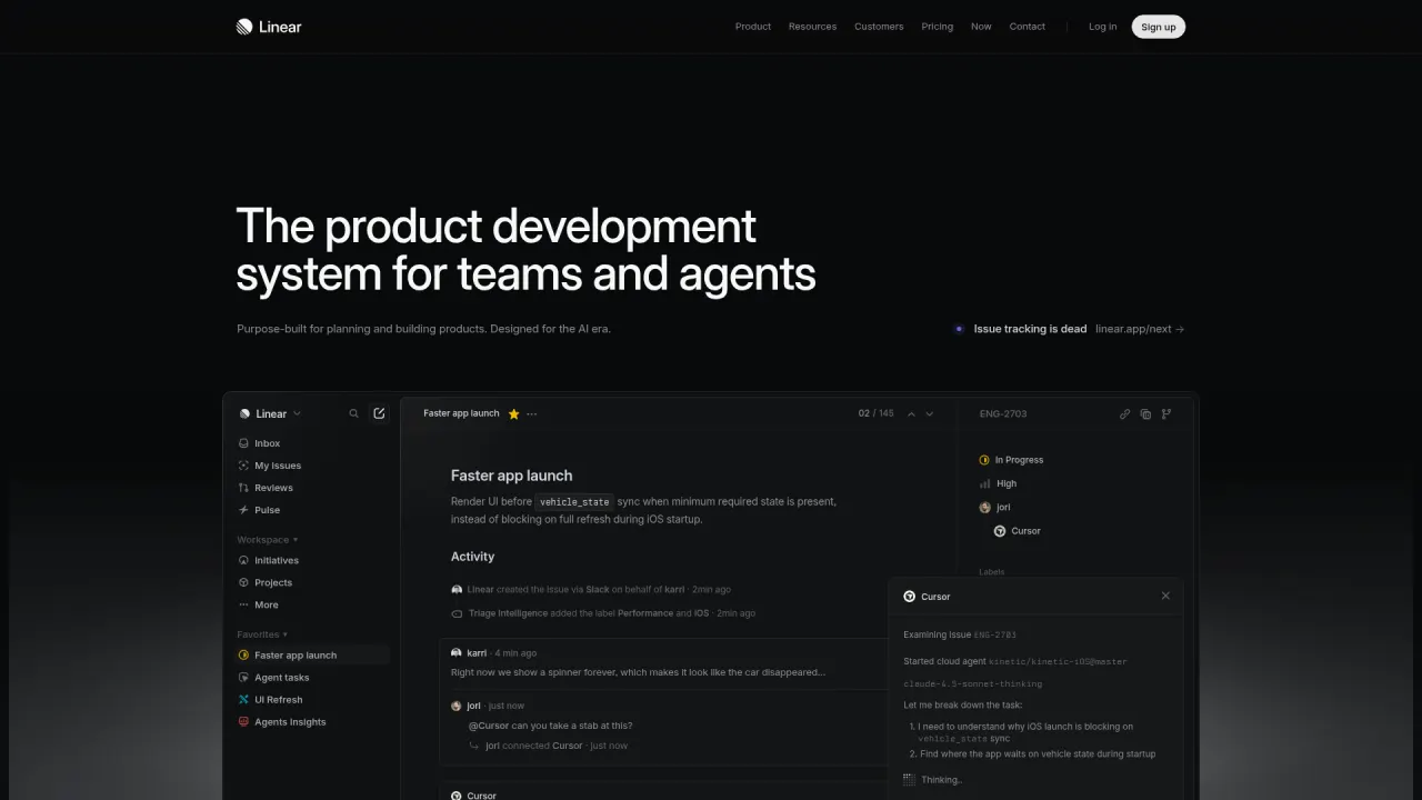
Hero is the actual product, not a stylized 3D abstraction of it. Real issue, real activity log, real labels, real agent thread. The image earns its place by being the product itself.
The rule:
## Hero imagery
- No abstract floating 3D objects in the hero (spheres, cubes, blobs, orbs).
- No particle systems, no mesh gradients as hero background, no "cosmic" imagery.
- If the hero has imagery, it must explain the product: real UI, real output, real artifact.
- If no real artifact exists yet, prefer a text-only hero over a decorative 3D asset.
- Ask: "What is this object doing for the story?" If the answer is "nothing", remove it.
5. Over-animated everything
What it looks like: text sliding in from every direction. Every block fades, scales, rotates, or parallaxes. Hover effects on everything. Load sequences that take 3 seconds before anything is usable.
Why the model probably produces it: Framer Motion examples, Webflow showcases, and Awwwards winners are over-represented in training data relative to restrained sites, which rarely get showcased in galleries.
Why it fails: motion loses hierarchy the same way typography does when everything is bold. Constant animation creates fatigue and lowers trust.
Almost entirely still. The only motion is a slow ambient gradient and the user's own scroll. No counter, no scroll-jack, no parallax. The product feels calm because the site is calm.
The rule:
## Motion
- No scroll-triggered entrance animations. Content is visible on load.
- No parallax. No stagger reveals. No blur-to-focus entrances.
- Hover transitions: 150ms ease-out, opacity 0.7 or translateY(-1px) only.
- No scale-on-hover, no rotate-on-hover, no elastic easing.
- Motion exists for 3 reasons only: feedback (hover), orientation (navigation state), emphasis (one key moment per page).
Pair this with the Motion Decision Tree for the full framework.
6. Spacing without rhythm
What it looks like: tight sections followed by huge empty gaps. Inconsistent padding from block to block. Visual density that changes randomly.
Why the model probably produces it: without a spacing scale in the prompt, each component gets its own arbitrary value. The model is optimizing locally, not globally.
Why it fails: the page feels generated rather than composed. Rhythm is one of the first things that separates generic output from designed output.
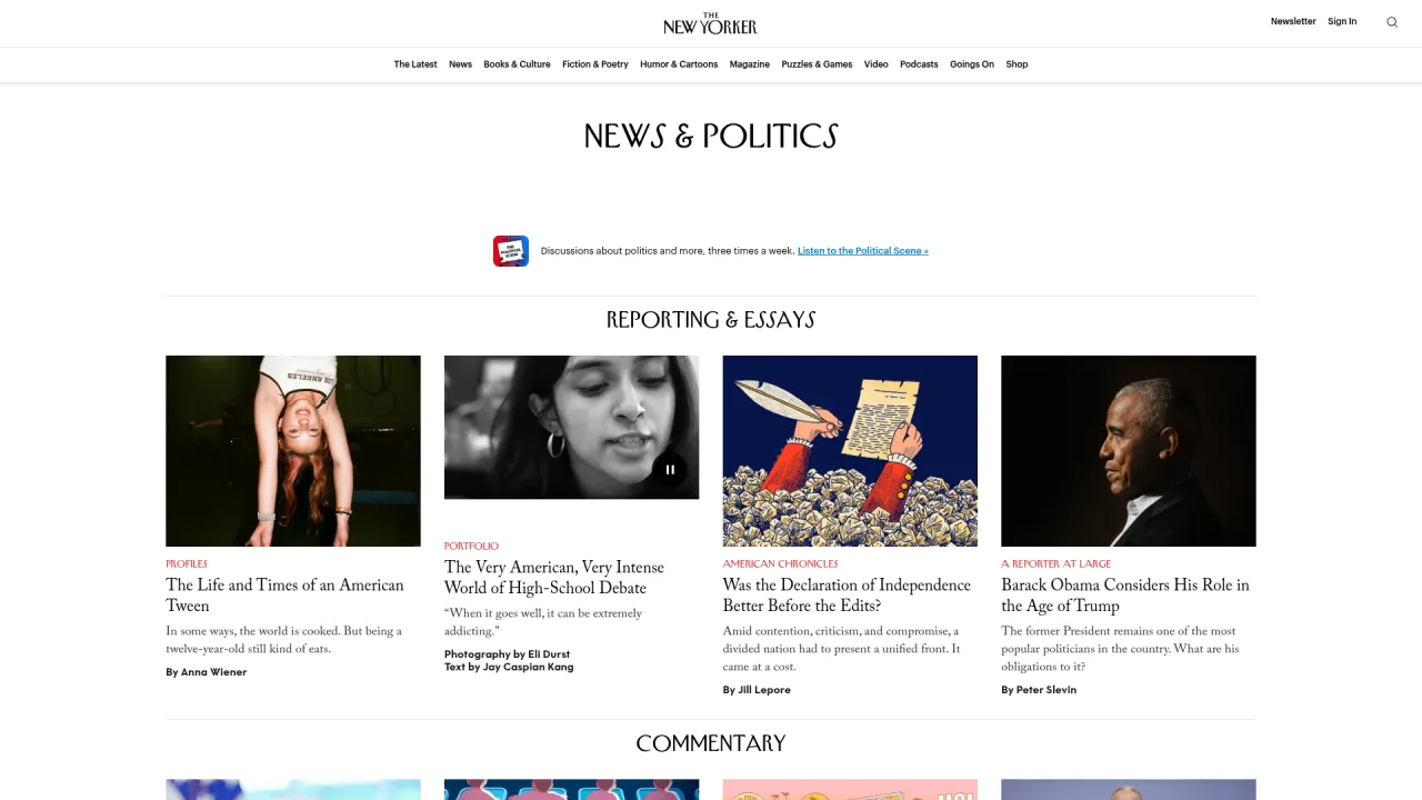
Every story block sits on the same vertical grid. Image, kicker, headline, dek, byline, gap, next story. The rhythm is so strict it disappears, which is the point: nothing competes with the writing.
The rule:
## Spacing
- Define a spacing scale and use only these values: 4, 8, 12, 16, 24, 32, 48, 64, 96, 120.
- Section spacing (between major sections): 96px or 120px.
- Subsection spacing (within a section): 48px or 64px.
- Card padding: 24px or 32px. Nothing in between.
- Grid gaps: 16px or 24px depending on density.
- If Claude picks a value outside this scale, it must ask first.
7. Typography without hierarchy
What it looks like: headlines that are all similar in size. Too many font weights. Mixed serif and sans-serif with no logic. Decorative type choices with no structure.
Why the model probably produces it: without a type scale, each heading gets a size picked independently. Weight 800 sits in the same statistical cluster as “important” in the training data, so headlines drift toward it by default.
Why it fails: the page may look styled but it does not read clearly. It feels like a mockup rather than a system.
Clean typographic descent: mascot, oversized headline, smaller body, button row. Each level is a step down in scale. The decorative shapes are kept far enough from the text block that the hierarchy still reads cleanly.
The rule:
## Typography scale
- Maximum 3 sizes per section: headline, body, caption.
- Full scale: 56 / 36 / 24 / 17 / 15 / 13 / 11 px.
- Maximum 2 font weights across the entire site.
- Hero headline: 56px desktop, 36px mobile. One size only.
- Section title: 24px. Subsection title: 17px bold.
- No italic body text. No all-caps except for 11px meta labels.
- Size contrast creates hierarchy. Weight contrast is a fallback, not a first choice.
8. Reference soup
What it looks like: a little Apple, a little Linear, a little Stripe, a little “cinematic luxury.” Mixed metaphors and mixed design languages on the same page.
Why the model probably produces it: when you tell the model “inspired by Apple and Stripe and Linear,” it blends them. Blending opposing references averages their personalities away.
Why it fails: the result has ingredients but no identity.
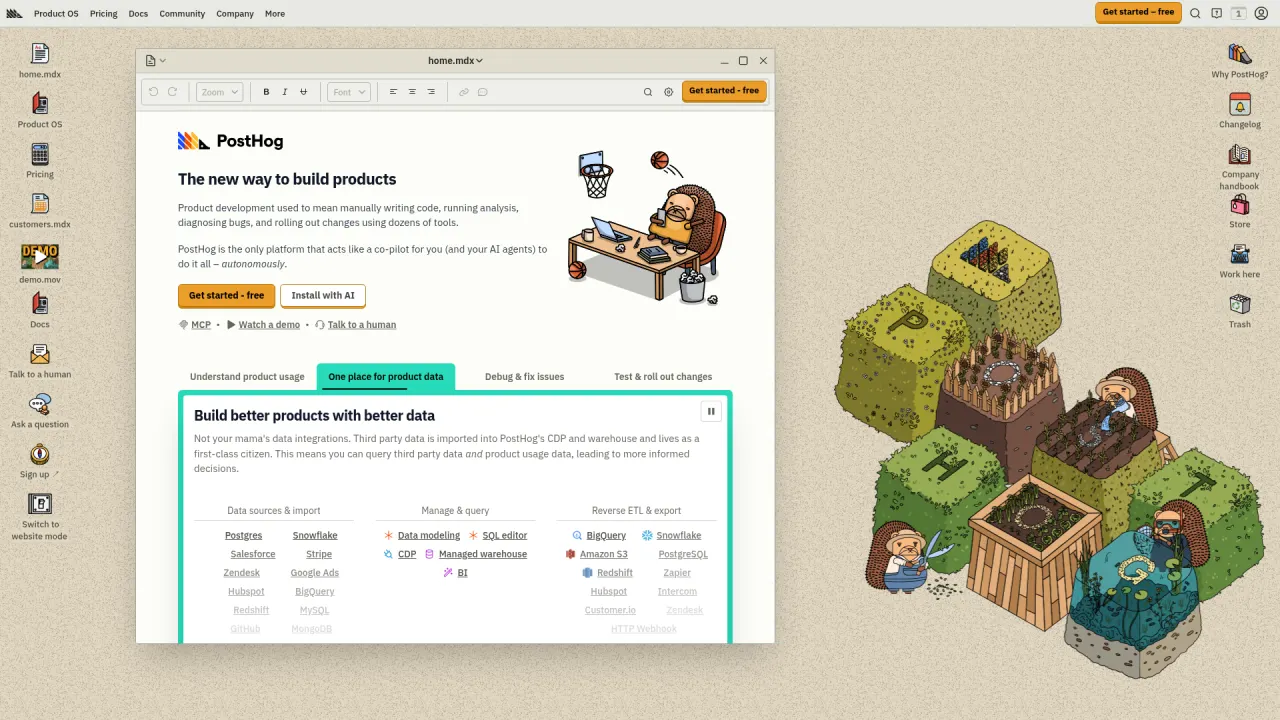
Looks like nothing else in the analytics category. A skeuomorphic desktop, hand-drawn hedgehog mascot, isometric garden scene. One worldview, executed everywhere, in detail. Not blendable with Linear, Stripe, or Apple.
The rule:
## References
- Choose ONE dominant visual direction and ONE supporting influence. No more.
- Name the reference in the CLAUDE.md explicitly: "Primary reference: [name]. Supporting: [name]. Everything else is off-limits."
- Define what should NOT be borrowed, not just what should be.
- When in doubt, ask: "Which reference wins in this conflict?"
9. No content logic
What it looks like: beautiful sections with weak copy structure. No narrative movement. Headlines that say nothing (“Revolutionize Your Work”). Three icon-cards of adjectives instead of concrete benefits.
Why the model probably produces it: without content rules, the model writes the average landing page copy of the last decade. “Revolutionize”, “seamless”, “unlock”, “supercharge”, “game-changer”.
Why it fails: the page may impress for three seconds and then collapse because nothing is being communicated. The user cannot tell what the product does.

Every section answers a specific question with a specific noun. 'Accept payments. Offer financial services. Custom revenue models. From your first transaction to your billionth.' No 'unlock', no 'revolutionize'. The product list IS the value prop.
The rule:
## Copy logic
- Every section must answer one specific question the user has at that moment.
- Headlines are statements, not teases. "Design tokens that work." not "Ready to transform your tokens?"
- No buzzwords: "leverage", "unlock", "empower", "supercharge", "revolutionize", "seamless", "game-changer".
- Feature cards name the concrete benefit with a noun, not an adjective. "Automatic token sync" not "Fast".
- Before shipping a section, ask: "What does the user now know that they did not know before?" If the answer is nothing, rewrite.
10. Decorative feature-card icons
What it looks like: three feature cards in a row. Each has a pastel-tinted circle (purple, blue, green). Each circle holds an abstract icon (a square, a circle, a checkmark). One-word title underneath (Fast, Smart, Simple) plus a generic one-line description.
Why the model probably produces it: the pattern is so dominant in the training data that “feature grid” reliably resolves to this exact layout. Lucide-react icons and Tailwind pastel-tints make it cheap to assemble.
Why it fails: the icons carry zero meaning. The pastel circles are pure decoration. The one-word titles (“Fast”) describe attributes, not benefits. A reader closes the page knowing nothing about what the product does.

Names the categories with the words people actually use. 'Have better sex.' 'Regrow hair.' 'Start your weight loss today.' Real product photos, real medication names (Wegovy), real claims. No 'unlock your wellness journey'.
The rule:
## Feature cards
- No abstract icons in pastel circles. No lucide-react sparkles, zaps, or shields as decoration.
- If a feature has an icon, it must depict the actual thing (a real screenshot, a real artifact, a number).
- Titles are noun phrases, not adjectives. "Automatic token sync" not "Fast". "End-to-end encryption" not "Secure".
- Description is one concrete sentence about what the user gets, with at least one specific noun.
- Maximum 4 cards. If you need more, the page is a list, not a feature grid.
The combined anti-pattern block
Drop this into your CLAUDE.md to prevent all 10 at once. You can remove any rule you disagree with, but keep the structure.
## Anti-patterns to avoid

When generating any page, section, or component, do not produce:

1. "Premium" clichés: dark-mode + gold + serif headlines + "exclusive" copy.
2. Gradient overload: more than one gradient per page, colored glow effects, multi-color button backgrounds.
3. Fake depth: default shadows on cards, glassmorphism, stacked shadow layers, floating elements without purpose.
4. Abstract 3D hero objects: spheres, orbs, cubes, blobs, particles, mesh gradients in the hero.
5. Motion spam: scroll entrance animations, parallax, stagger reveals, scale-on-hover, bounce easing.
6. Random spacing: padding values outside the defined scale (4, 8, 12, 16, 24, 32, 48, 64, 96, 120).
7. Typography without hierarchy: more than 3 sizes per section, more than 2 weights total, all-headline sections.
8. Reference soup: mixing more than one dominant visual influence.
9. Buzzword copy: "revolutionize", "seamless", "unlock", "supercharge", "empower", "game-changer".
10. Decorative feature-card icons: pastel circles, abstract icons, adjective-only titles.

For each, if the generated output contains one of these patterns, STOP and fix it before continuing.
Do not produce a final output that violates any of these rules without explicitly flagging which rule and why.
Paste this directly under your visual standards section. It becomes a passive audit that runs on every generation.
Bonus: micro anti-patterns to also block
These are smaller, sneakier patterns I keep finding in AI-generated UI. They feel innocent in isolation but are equally generic, and they show up across every model and every framework I have tested.
- Containers with rounded corners and a left-border accent stripe. Every framework’s default callout box. The model reaches for it because it screams “callout” in the training data, but it has become as generic as a 90s blockquote.
- SVG-drawn imagery. When Claude does not have a real image, it is tempted to “draw” one in SVG: a generic illustration of three people at a desk, or a stylized icon. A grey placeholder is always better than a bad attempt at the real thing. Ask for the real asset instead.
- Overused fonts. Inter, Roboto, Arial, system-ui, Fraunces. These are not bad fonts. They have just become the statistical default for “modern” and “tasteful.” If you want a piece of work to feel authored, the typeface is the cheapest place to start.
- Emoji everywhere. Models love adding 🚀 ✨ 🎯 to make output feel “friendly.” Unless your brand explicitly uses emoji, they read as AI tells. Block them by default; allow them per-brand.
The CLAUDE.md addition:
## Micro anti-patterns

- No callout boxes with a left-border accent stripe.
- No SVG-drawn imagery. Use grey placeholders and ask for real assets.
- Default fonts to avoid: Inter, Roboto, Arial, system-ui, Fraunces.
  - Pick a typeface that has a point of view. If unsure, ask.
- No emoji unless the brand explicitly uses emoji.
How to use the gallery as a review tool
You can also run this gallery as an explicit check after generation. Create a skill in ~/.claude/skills/anti-pattern-check/SKILL.md:
---
name: anti-pattern-check
description: Review the most recent generation for the 10 most common AI design anti-patterns.
  Run this after Claude produces any page, section, or layout.
---

Review the most recent generated file against these 10 patterns:

1. Luxury by default (dark + gold + serif + "premium" language)
2. Gradient overload (>1 gradient per page, glow effects)
3. Fake depth (shadows on static cards, glassmorphism, stacked shadows)
4. Random 3D hero (abstract floating objects, orbs, blobs, mesh gradients in hero)
5. Over-animated (scroll-triggered, parallax, scale-on-hover, bounce)
6. Spacing without rhythm (values outside the project's spacing scale)
7. Typography without hierarchy (>3 sizes, >2 weights, all-similar-size headings)
8. Reference soup (mixing Apple + Stripe + Linear + "luxury" on one page)
9. No content logic (buzzword copy, adjective-only feature cards)
10. Decorative feature-card icons (pastel circle + abstract shape + adjective title)

For each pattern found:
- Name the pattern and the exact line or component it appears in
- Explain why it weakens the design
- Propose a specific fix using the project's CLAUDE.md rules
- Apply the fix inline

If none are found, report: "Clean. No anti-patterns detected."
Invoke it with /anti-pattern-check after any generation. You get a named, explained critique in seconds instead of manually eyeballing the output.
What to do next
The shift from “generic AI output” to “output with a point of view” is almost always one file and one set of rules away. Run the exercise below on a page you actually shipped (or almost did).
Audit your last AI generation for the three loudest anti-patterns
-
Score your last generation
Open the most recent landing page, hero, or marketing block you generated with an AI tool. Walk the ten anti-patterns above in order. For each, write PASS, WARN, or FAIL on a scratch pad, with one sentence of evidence. Tally the FAILs.
- You listed at least one specific element (a gradient, a shadow, a headline, a radius) as evidence for each WARN or FAIL
- The top three FAILs are not guesses, they are patterns you can point at in the live file
- You noticed at least one pattern you had not named before reading this guide
-
Paste the matching rules into your CLAUDE.md
For each of your top three FAILs, copy the matching rule block from the gallery into your project’s
CLAUDE.mdunder a## Anti-patterns to avoidsection. Regenerate the same page with the new rules in place. Compare the new output to the original.CLAUDE.mdnow has three named anti-pattern blocks with specific thresholds (pixel values, shadow rules, banned words)- The regenerated page no longer triggers those three FAILs
- You can name at least one new taste rule of your own, written in the same tight format, that the gallery did not cover
The 10 anti-patterns are symptoms of one larger problem: polish is the new floor, not the ceiling. Every generated site is clean and forgettable until you add an opinion. Each rule in this gallery is one way to encode that opinion before the model fills the gap with the average of the internet.
Finished this lesson?
Mark it complete to track your progress through "Visual Direction & Style".