Design Token Naming: 7 Systems Compared
How Polaris, Carbon, Primer, Material Design, Lightning, Spectrum, and Fluent name their tokens. Side-by-side comparison with patterns, examples, and what to steal for your system.
- Basic understanding of design tokens
- Property-first color.background.primary
- Role-first primary.background.color
- Semantic action.default, surface.raised
Every design system names tokens differently. There is no universal standard. But after studying how the top systems do it, clear patterns emerge.
This guide compares 7 major design systems and gives you a framework to pick the right approach for your team.
For hands-on naming tools, see namedesigntokens.guide
The 7 systems at a glance
| Criterion | Polaris Shopify | Carbon IBM | Primer GitHub | Material 3 Google | Lightning Salesforce | Spectrum Adobe | Fluent 2 Microsoft |
|---|---|---|---|---|---|---|---|
| Token count | 300+ | 500+ | 200+ | 100+ | 400+ | 600+ | 300+ |
| Prefix | --p- | $ / --cds- | --color- / --primer- | --md-sys- | --slds-g- | --spectrum- | none |
| Format | kebab-case | kebab + Sass | kebab-case | kebab-case | kebab-case | kebab-case | camelCase |
| Pattern | property-first | property-first | semantic | system-spec | numeric scale | property-first | role-first |
| Spacing scale | 100–800 | 01–13 | named | 8px grid | 1–9 | 100–600 | S/M/L |
Naming patterns side by side
Color tokens
| System | Background | Text | Border |
|---|---|---|---|
| Polaris | --p-color-bg-fill-brand | --p-color-text-brand | --p-color-border-brand |
| Carbon | $background-brand | $text-primary | $border-strong-01 |
| Primer | --color-accent-subtle | --color-accent-fg | --color-accent-emphasis |
| Material | --md-sys-color-primary-container | --md-sys-color-on-primary | --md-sys-color-outline |
| Lightning | --slds-g-color-brand-base-50 | --slds-g-color-neutral-base-100 | --slds-g-color-border-base-1 |
| Spectrum | --spectrum-accent-background-color-default | --spectrum-neutral-content-color-default | --spectrum-gray-border-color-default |
| Fluent | colorBrandBackground | colorNeutralForeground1 | colorNeutralStroke1 |
Spacing tokens
| System | Small | Medium | Large |
|---|---|---|---|
| Polaris | --p-space-200 (8px) | --p-space-400 (16px) | --p-space-800 (32px) |
| Carbon | $spacing-03 (8px) | $spacing-05 (16px) | $spacing-07 (32px) |
| Primer | --primer-spacing-normal | --primer-spacing-spacious | - |
| Material | Hardcoded 8px grid | - | - |
| Lightning | --slds-g-spacing-3 | --slds-g-spacing-5 | --slds-g-spacing-7 |
| Spectrum | --spectrum-spacing-200 | --spectrum-spacing-400 | --spectrum-spacing-600 |
| Fluent | spacingHorizontalS | spacingHorizontalM | spacingHorizontalL |
Three naming philosophies
1. Property-first (Polaris, Spectrum)
--{prefix}-{category}-{property}-{variant}
--p-color-bg-fill-brand
--spectrum-accent-background-color-default
The token name describes what it does. Background, text, border. Then what kind. Brand, subtle, emphasis.
Pros: Self-documenting. Easy to find what you need. Cons: Long names. Category boundaries can blur.
2. Role-first (Carbon, Lightning)
--{prefix}-{role}-{modifier}
$background-brand
--slds-g-color-brand-base-50
The token name describes its role in the system. Background, primary, brand. Numbers indicate scale position.
Pros: Clean, short names. Clear hierarchy. Cons: Requires knowing the system’s role definitions.
3. Semantic-abstract (Material, Fluent)
--md-sys-color-{semantic-role}
colorBrandBackground
The token name is an abstraction. “Primary” means nothing about color. It means “the most important thing.” The system decides what color that maps to.
Pros: Theme-agnostic. Easy to swap entire palettes. Cons: Harder to debug. “What color is primary again?”
Token layers compared
Every mature system has at least 3 layers:
Primitive          →  Semantic         →  Component
blue-500 color-bg-brand button-bg-primary| System | Primitives | Semantic | Component |
|---|---|---|---|
| Polaris | Not exposed | --p-color-bg-fill-* | Not exposed |
| Carbon | $blue-60 | $background-brand | $button-primary |
| Primer | --base-color-scale-blue-5 | --color-accent-fg | Limited |
| Material | --md-ref-palette-primary40 | --md-sys-color-primary | --md-comp-filled-button-container-color |
| Lightning | --slds-g-color-blue-50 | --slds-g-color-brand-base-50 | Not exposed |
| Spectrum | --spectrum-blue-900 | --spectrum-accent-background-color-default | --spectrum-actionbutton-background-color-default |
| Fluent | colorPaletteBlue600 | colorBrandBackground | Component-level in code |
What to steal for your system
If you’re starting fresh
Use the Polaris pattern: --{prefix}-{category}-{property}-{variant}. It’s verbose but unambiguous. New team members can read the name and know exactly what it does.
If you have an existing system
Map your tokens to the 3-layer model (primitive > semantic > component). Most systems that struggle have tokens that skip the semantic layer and go straight from primitive to component.
If you support multiple brands
Follow Material Design’s approach: separate ref (reference/primitive) tokens from sys (system/semantic) tokens. Each brand overrides the sys layer, primitives stay shared.
Universal rules (every system agrees on these)
- Use a prefix.
--p-,--cds-,--slds-. Avoids conflicts with other libraries. - Separate concerns. Color tokens name the role (background, text, border), not the color (blue, red).
- Scale numerically for primitives.
blue-500,spacing-400. Notblue-medium. - Use semantic names for consumption. Components reference
color-bg-brand, neverblue-500. - Document the “why.” Every token needs a description explaining when to use it.
Naming decision tree
Is it a raw value (hex, px, rem)?
  → Primitive token: {color}-{scale} or {category}-{step}

Does it describe a purpose?
  → Semantic token: {category}-{property}-{variant}

Is it tied to a specific component?
  → Component token: {component}-{property}-{state}
Interactive naming tool
namedesigntokens.guide is a free tool that generates consistent token names based on the patterns above. It has three surfaces depending on where you are in your naming process.
Start here
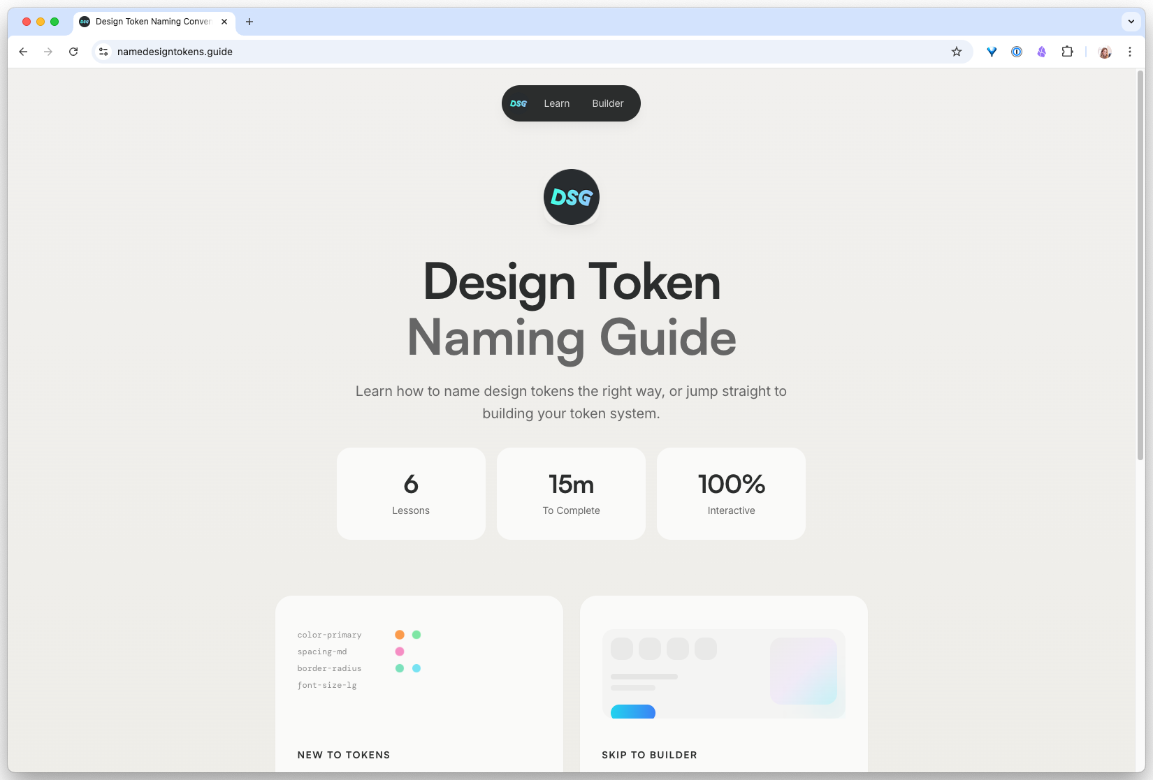
Wizard, for a first design system
If you’re naming tokens for the first time, the Wizard walks you through category, property, and variant decisions and outputs a full set that follows the industry patterns in this guide.
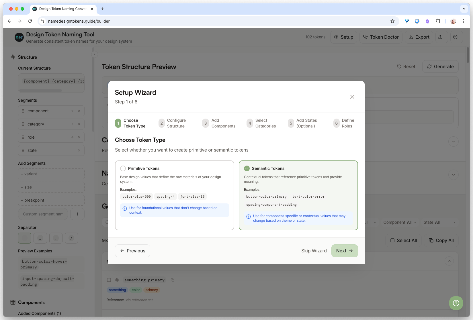
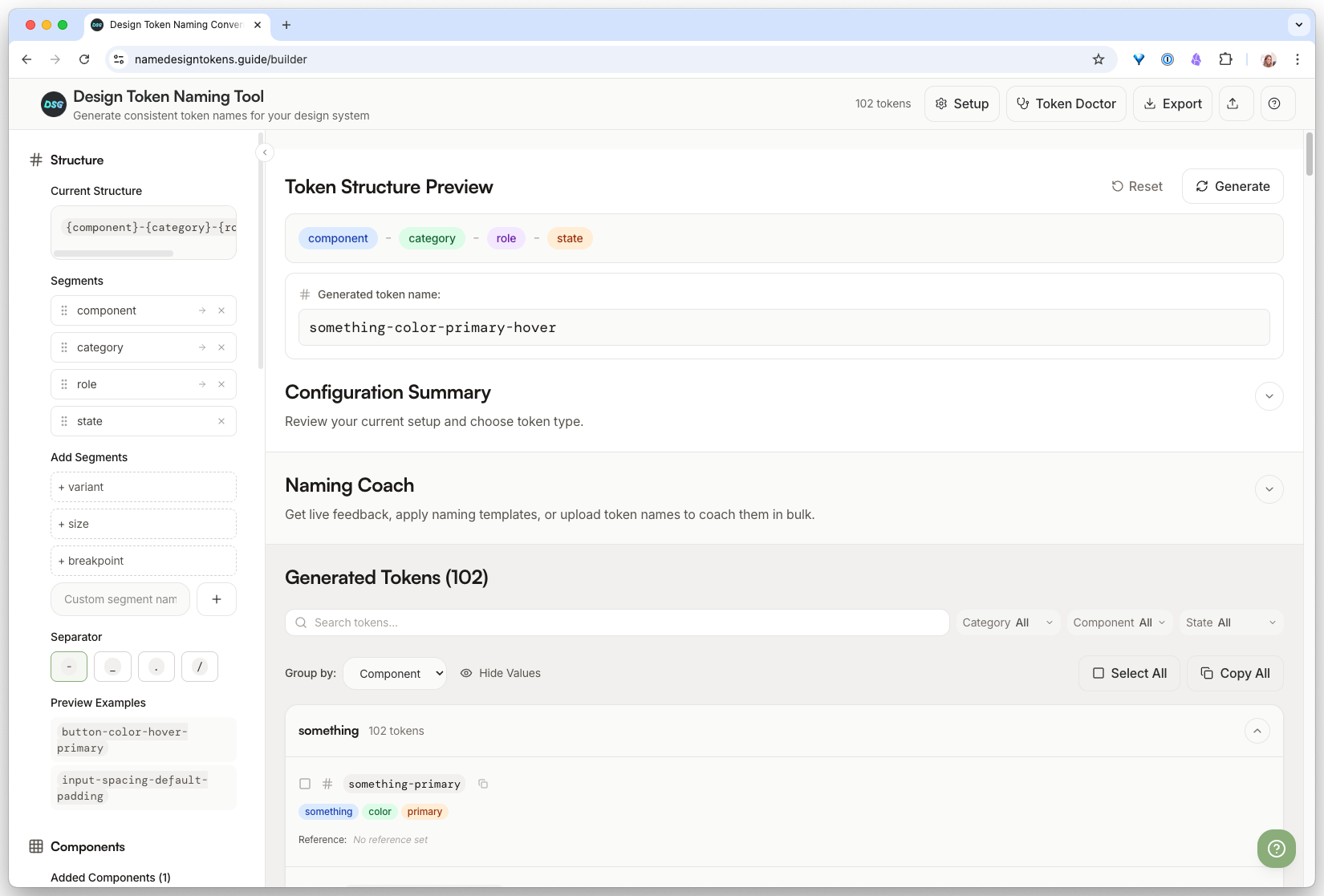
Builder, for when you know what you want
If you already have a naming convention in mind, the Builder lets you configure separators, casing, and token tiers directly and preview the output.
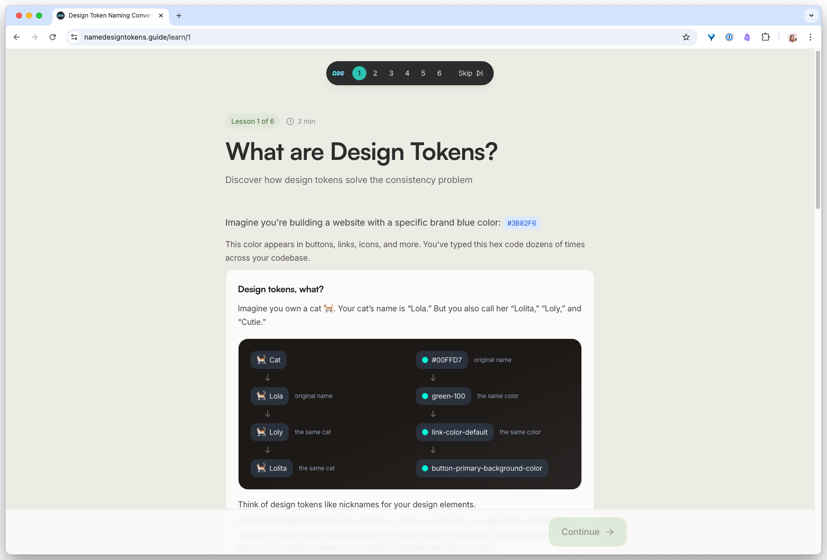
Learn, for the theory behind it
If you want to understand why certain patterns win, the Learn page breaks down the trade-offs between dot vs slash, kebab vs camel, and property-first vs role-first naming.
Name a real token set with AI, then automate it
-
Try it in Claude (the chat window)
Open Claude in the browser. Paste the prompt. Read the output carefully and answer the follow-up question about overlapping tokens. This is your baseline: one good prompt, one good result.
- Every hex has a semantic name like
color.background.primaryorcolor.feedback.danger, notcolor.red.500 - Claude flagged at least one ambiguous value and asked you to clarify (usually the accent color, because it could be
brandoraction) - The output is copy-pasteable as-is into a token file
I have raw color values that need semantic token names. Palette: - #FBFBFA (main background) - #111111 (main text) - #DFFF82 (brand accent) - #E8E5D4 (subtle surface) - #B4B0A8 (muted text) - #DC2626 (error) - #059669 (success) Conventions I want to follow: - Structure: category.intent.modifier (e.g. color.background.primary) - Intent names the role, never the hex - Use "danger" and "success", never "red" and "green" Output: one token per line, no explanations. After the list, flag any value that could serve two different intents and ask me which to keep. - Every hex has a semantic name like
-
Turn it into a Claude Code skill
Now make it reusable. In your project, create the file:
.claude/skills/name-tokens/SKILL.mdPaste the prompt from Step 1 as the skill body, but replace the hardcoded palette with an instruction: “Read the raw color values from
tokens/primitives.jsonin the current project. For each one, output a semantic name following the conventions below.”Add a skill frontmatter block at the top so Claude Code knows when to trigger it:
--- name: name-tokens description: Generate semantic token names from raw values in tokens/primitives.json. Use when the user mentions naming tokens, semantic layer, or runs /name-tokens. ---.claude/skills/name-tokens/SKILL.mdexists in your repo- Running
/name-tokensin Claude Code triggers the skill instead of a generic response - The skill reads from your actual
tokens/primitives.json(not a pasted palette)
-
Hook it up to real token files and run it
Point the skill at real values. If you do not have a token file yet, create a minimal one:
{
  "color": {
    "bone": "#FBFBFA",
    "ink": "#111111",
    "lime": "#DFFF82",
    "sand": "#E8E5D4"
  }
}
In Claude Code, run
/name-tokens. Compare the output to what you got in Step 1. Then: change one primitive value in the JSON (e.g., swap#DFFF82for#B8DFFF) and run it again. The semantic names should stay the same, because they describe role, not color.- The skill named every token in your JSON file without being asked for each one
- Changing the hex value did not change the semantic name (
color.brand.primarystayscolor.brand.primarywhether it is lime or blue) - You can now regenerate the semantic layer any time primitives change, in one command
- If it hallucinated a token that is not in your JSON, the skill prompt needs a stricter “only name values that exist in the file” instruction
Finished this lesson?
Mark it complete to track your progress through "Design System Automation".
Try with Prompts
Ready-to-use prompts related to this guide
Translate brand guidelines (PDF, style guide) into a structured set of design tokens with proper naming and hierarchy.
Map primitive color values to semantic design tokens with clear intent, usage rules, and accessibility notes.
Audit your design token names against naming conventions and flag inconsistencies, typos, and structural issues.