In 2023, AI in the interface meant a chatbot window in the corner and a ✨ icon on a button. Agents now run for minutes or hours, edit files, open browsers, ask for permission and keep working in the background. The patterns below repeat from product to product across web apps, mobile apps and terminals. Most of them have no component in today's design systems.
The 12 patterns to learn first
These show up in almost every serious agent product.
- Live plan / to-do checklist
- Collapsible tool-call / action log rows
- Scoped approval prompt (“Yes, and don't ask again”)
- Autonomy modes: plan mode / accept edits / auto
- Take control of the agent's browser
- Agent inbox: Needs input / Working / Completed
- Background/cloud agent sessions with PR status
- Generative UI and in-chat app widgets
- Per-hunk diff review: Keep / Undo / Apply
- Checkpoints and rollback
- “Thought for N s” thinking disclosure
- Hybrid ⌘K palette: “Ask AI or navigate”
Entry points: where AI lives in the UI
AI moved out of a separate chatbot and into the surfaces people already use: a sparkle button, a ⌘K palette, a docked panel, or the cursor itself.
01. Sparkle ✨ AI affordance with inline generate → Replace / Refine
A sparkle icon has become the shared signal for “AI here”. It opens an inline menu, and the generated text appears in place with Discard / Refine / Insert below / Replace actions, so you never leave the doc.
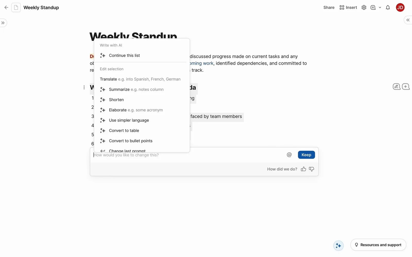
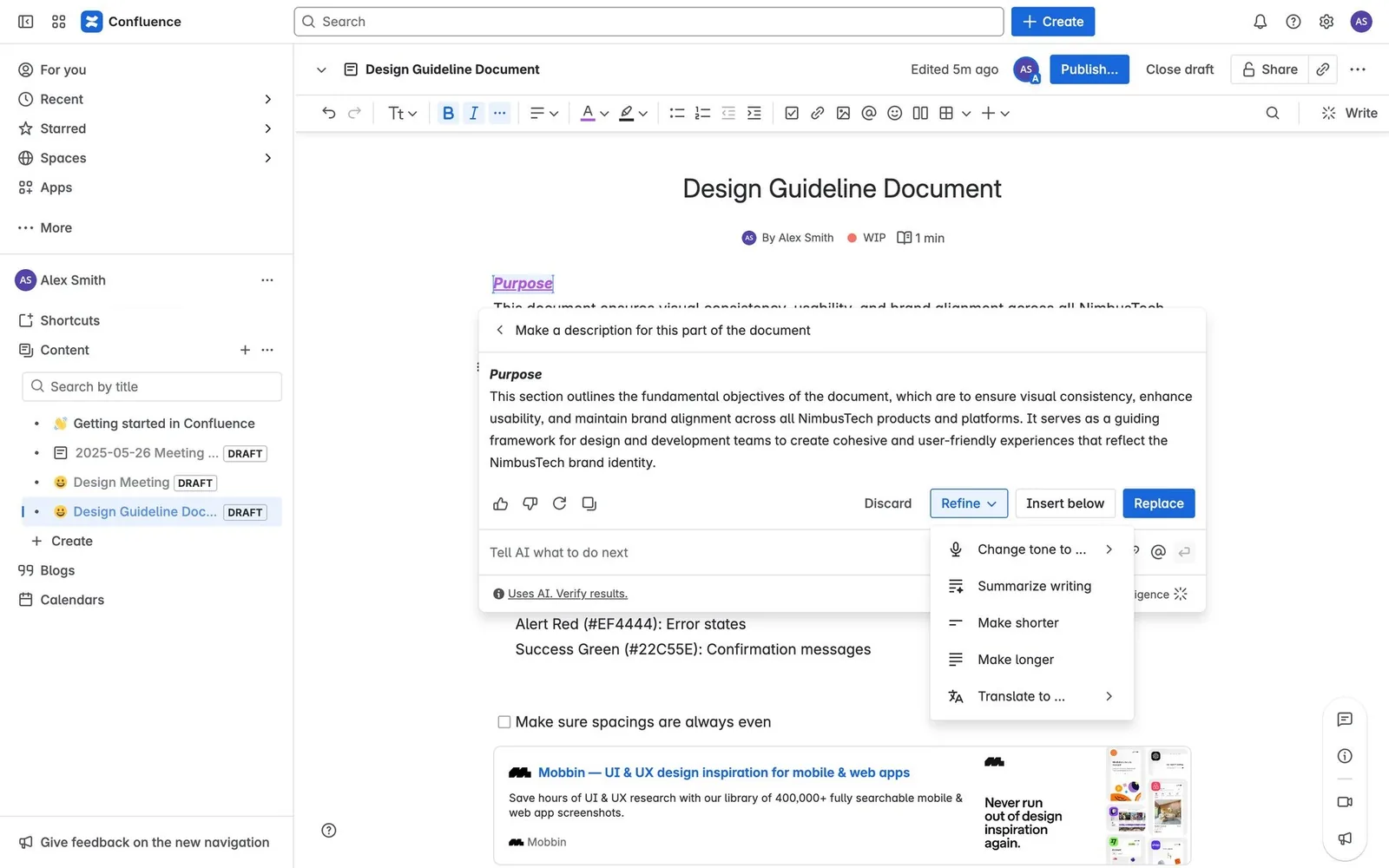
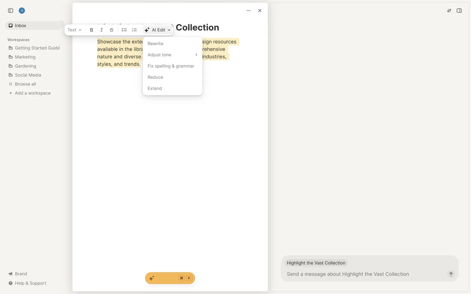
For your design system. The sparkle is now an icon with meaning, so give it a rule. When is it allowed? Is it always the same color? Many teams use a special "AI gradient" token here. Decide if you want one before five teams invent five gradients.
02. Hybrid ⌘K palette: “Ask AI or navigate”
The command palette now takes natural language as well as commands. One input either jumps to a tool or hands the query to the assistant.
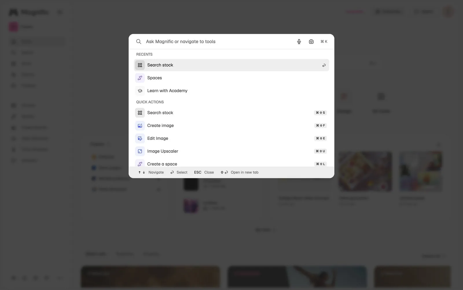
For your design system. If your library already has a Command palette, this is an extension of it: a fallback row at the bottom of the results ("Ask AI about …") and a loading state for the answer.
03. Docked side-panel copilot with a context chip
A persistent right-hand assistant panel sits next to your work. A chip such as “Current file + 1 item” shows exactly what the assistant can see.
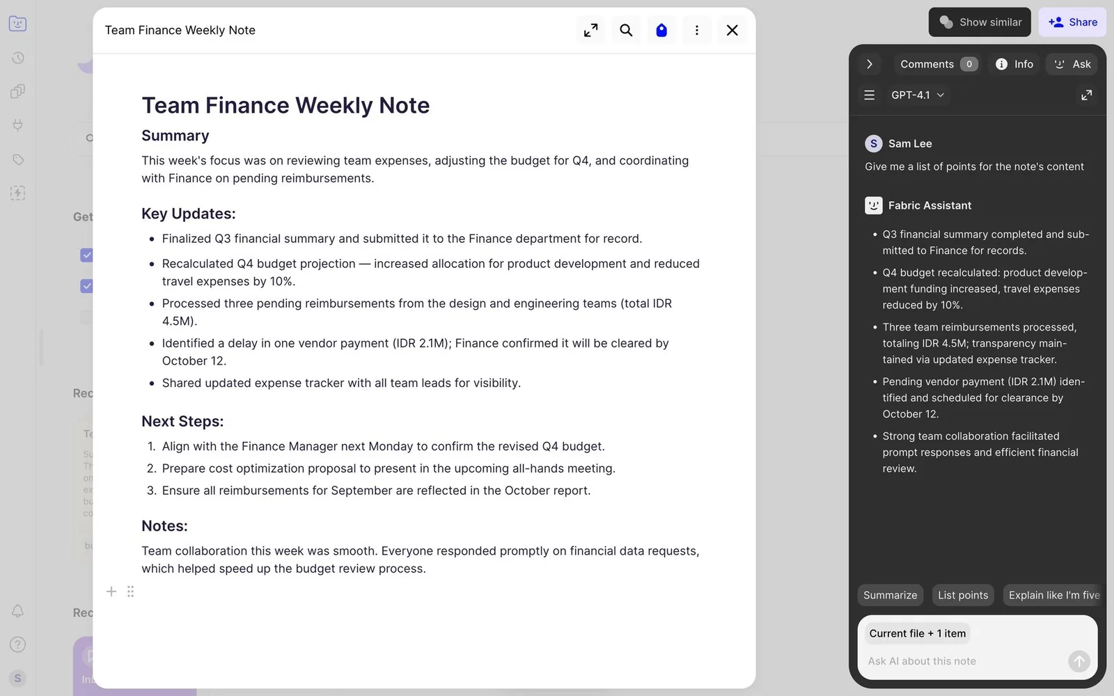
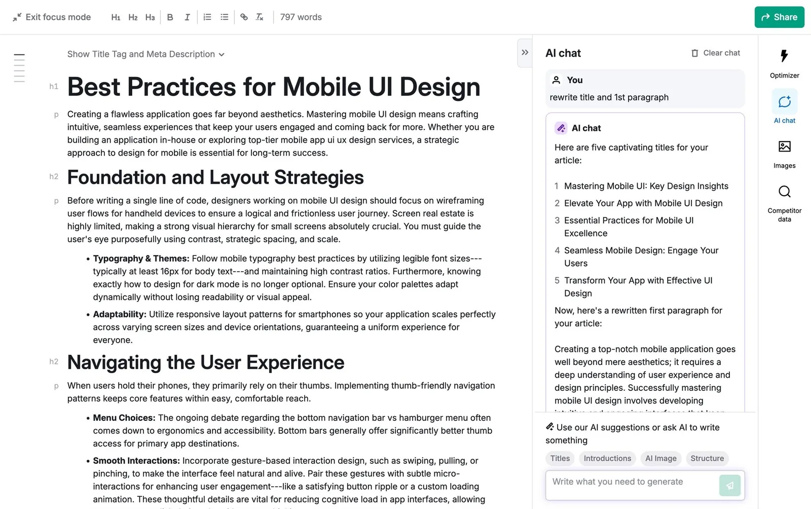
For your design system. The context chip is the small part that builds trust. People stop asking "does it know about this file?" when the answer is written on the panel.
04. Ghost text and Next Edit Suggestions
Grey inline completions accepted with Tab (or word by word). Next Edit Suggestions go further and predict where your next edit should happen, marking it with a gutter arrow.
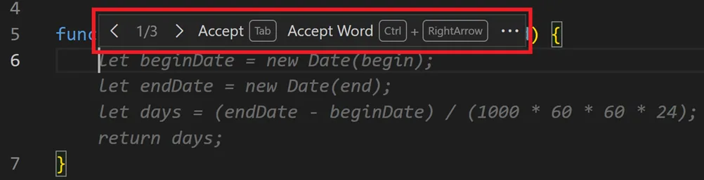
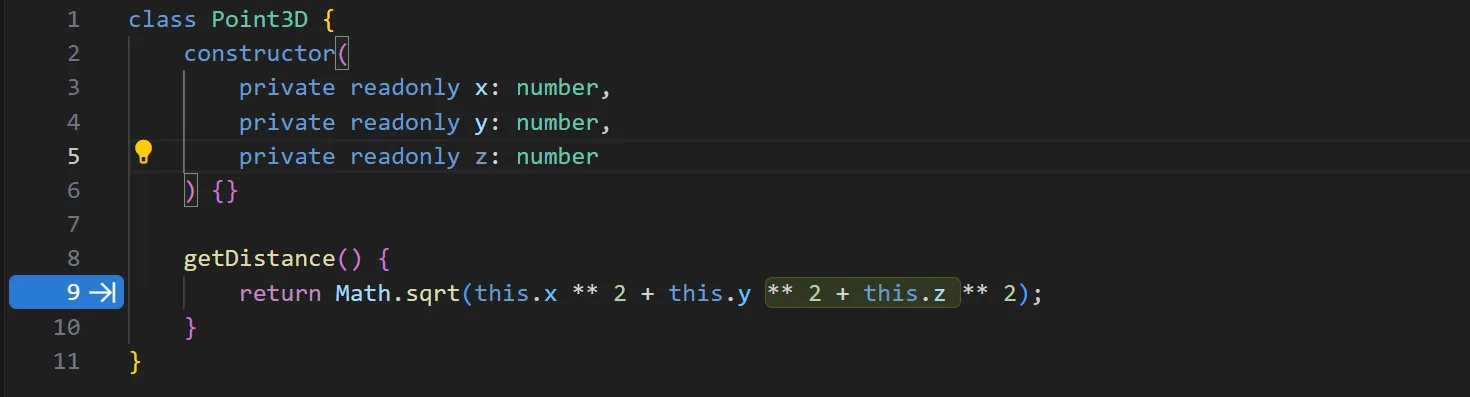
For your design system. This one started in code editors and is slowly moving into text fields everywhere. If your Textarea component might ever get suggestions, you'll need a "suggested text" color token that passes contrast and still reads as not yours yet.
05. Prompt starters and suggested follow-ups
An empty-state gallery of example prompts (with Shuffle), plus follow-up chips after each answer that suggest the next step.
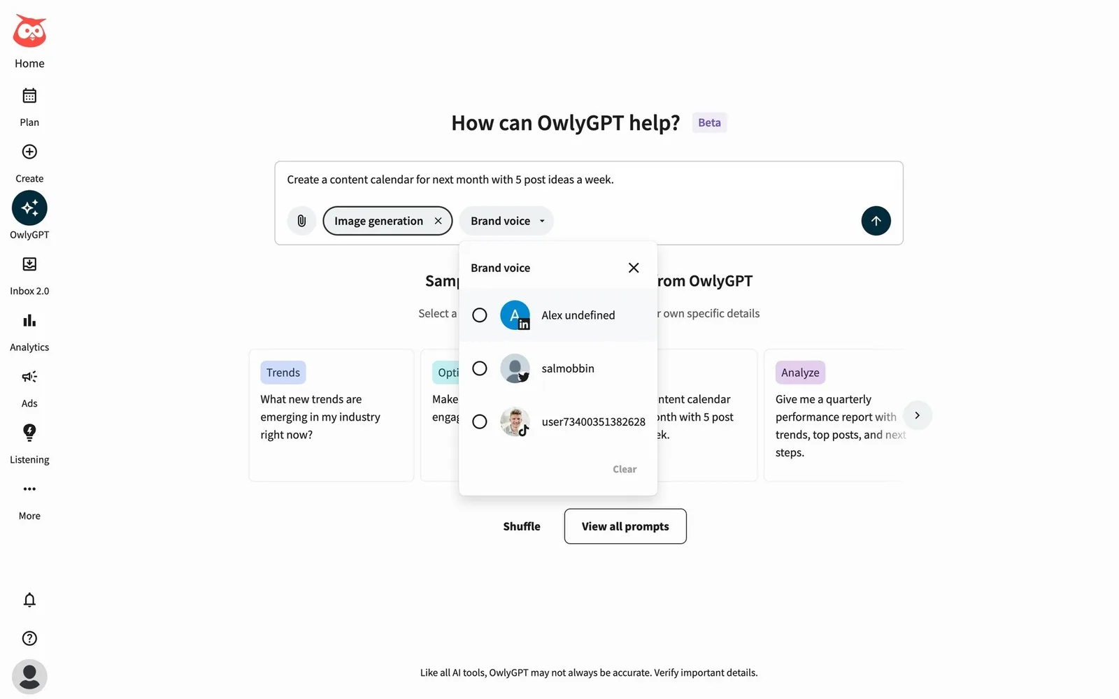
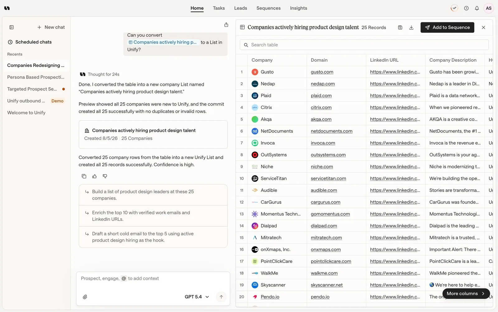
For your design system. The blank prompt box is the hardest screen in AI products. Prompt starters are an empty-state pattern, so they belong next to your other empty states in the docs.
Composer and context control
The prompt box has turned into a control surface. Users pick context, tools, model, effort and input mode before they hit send.
06. @-mentions and context chips
Typing @ pulls in files, docs, people or connected-app records as chips. The terminal equivalent is @path.
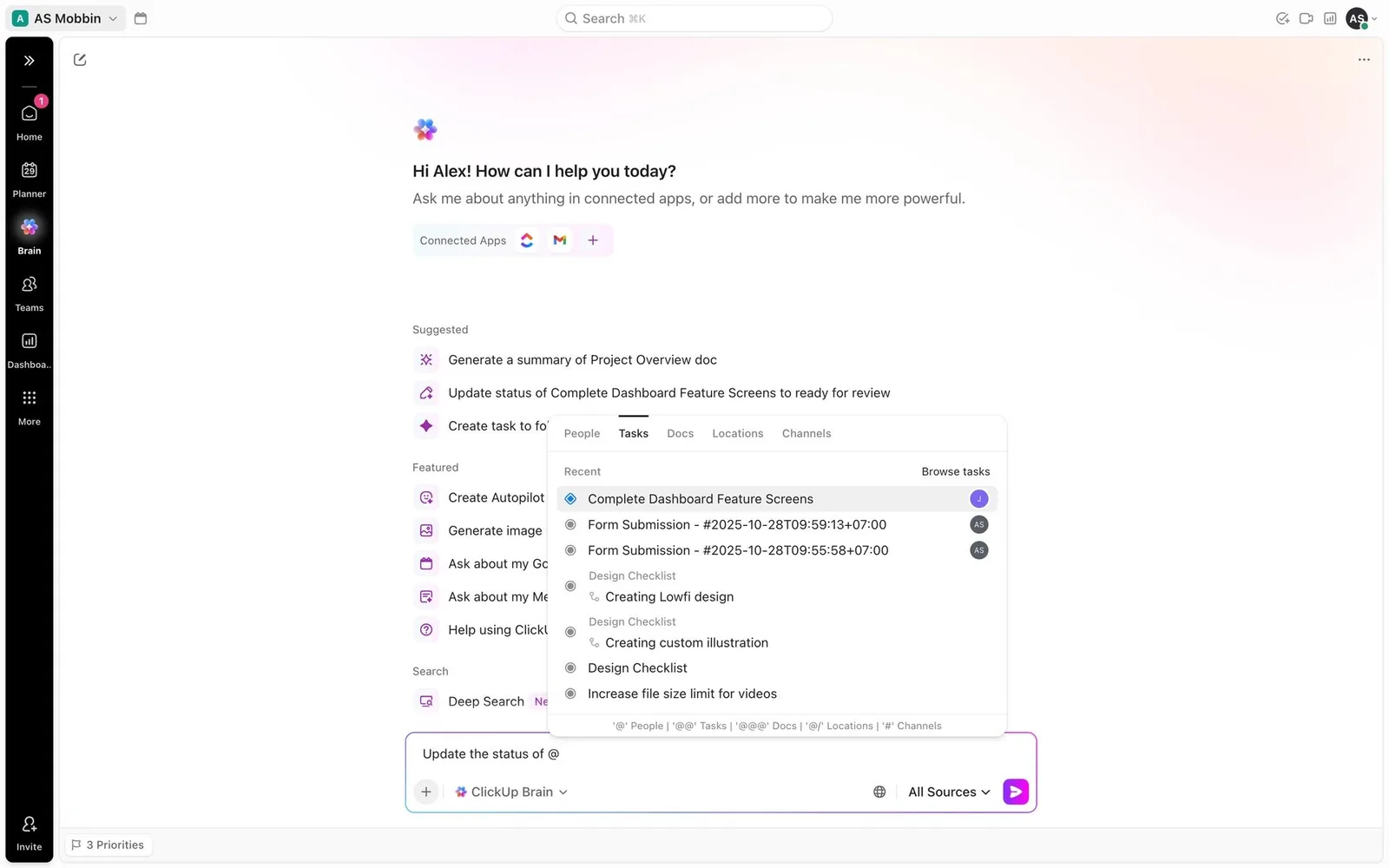
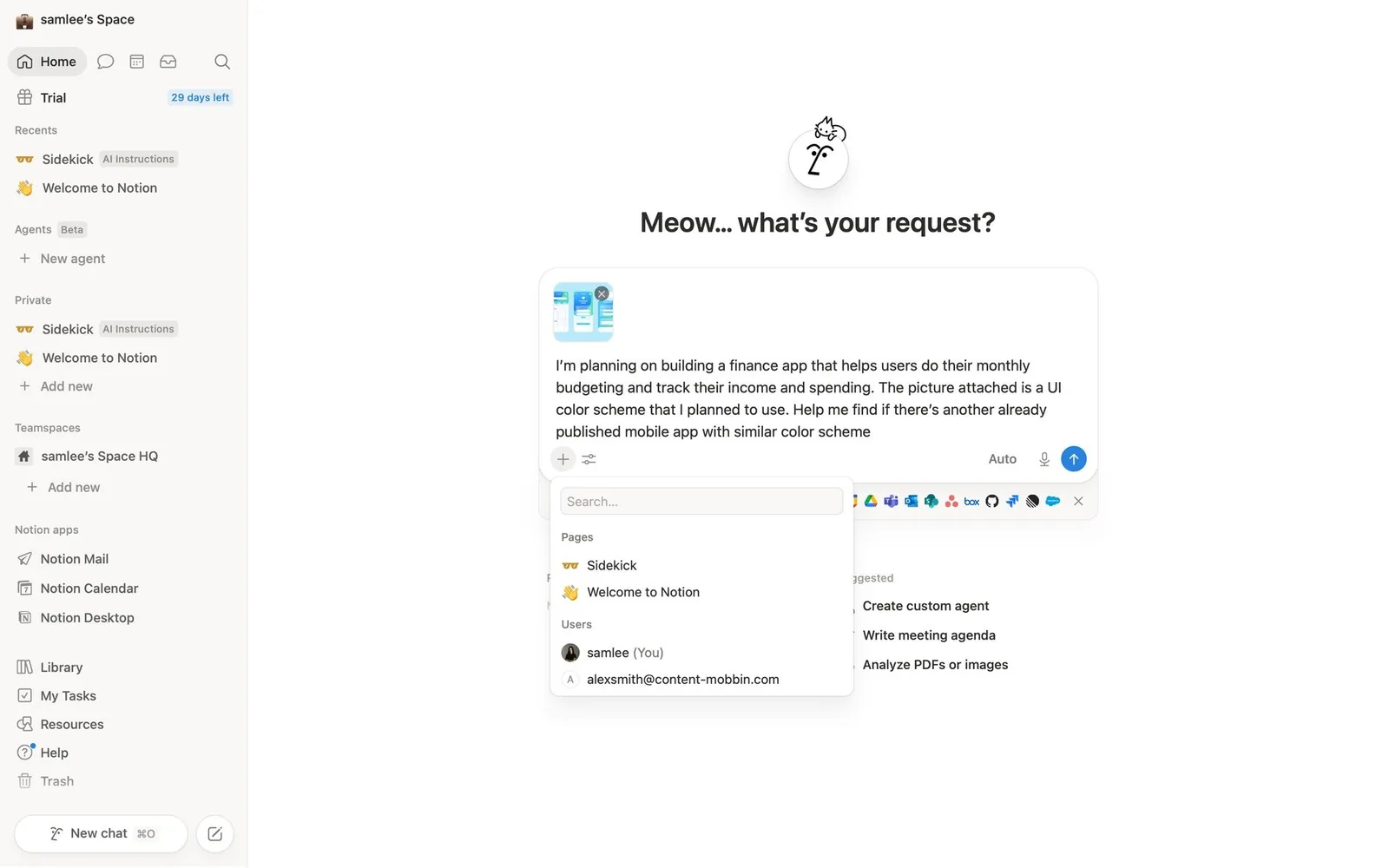
For your design system. You probably have a Mention component and a Chip component already. The new part is the chip that represents context the model will read, often with a file type icon and a remove button.
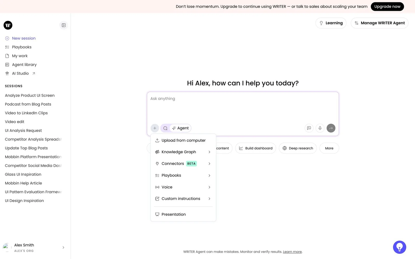
07. “+” tools/connectors menu and mode chips
A plus button in the composer opens tools, connectors and saved playbooks. Toggle chips such as Research or Voice switch the agent's mode.
08. Model picker, effort slider and agent tiers
Users choose the model and how hard it should think (effort/reasoning level), or pick a cost tier such as Lite / Economy / Power. In terminals this is a /model command.
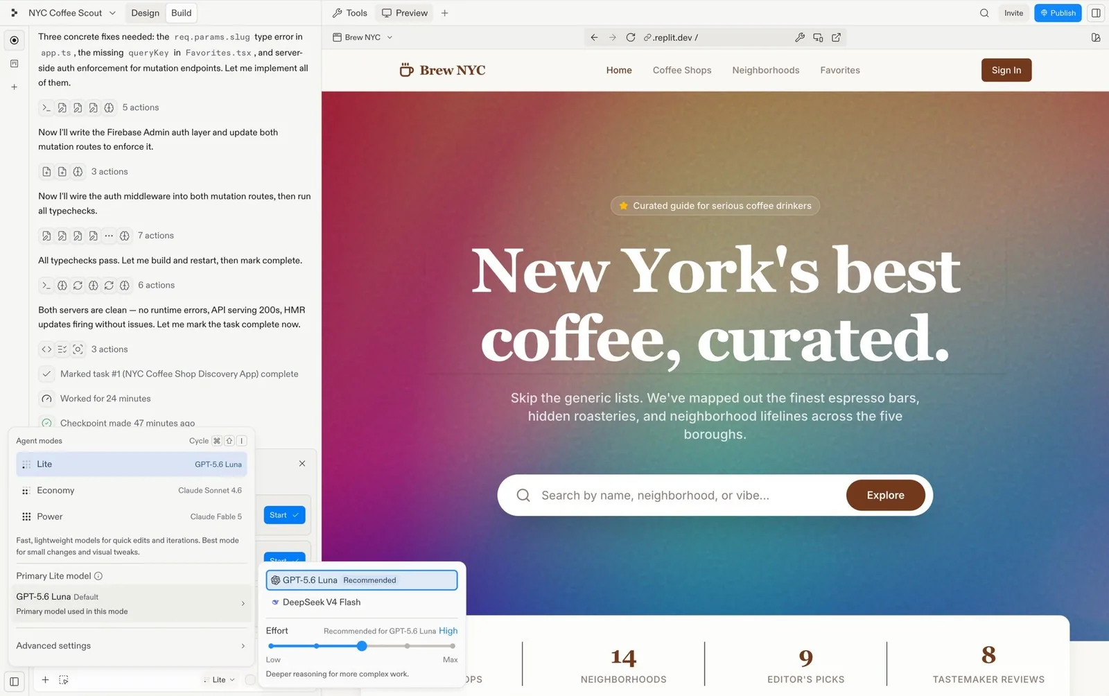
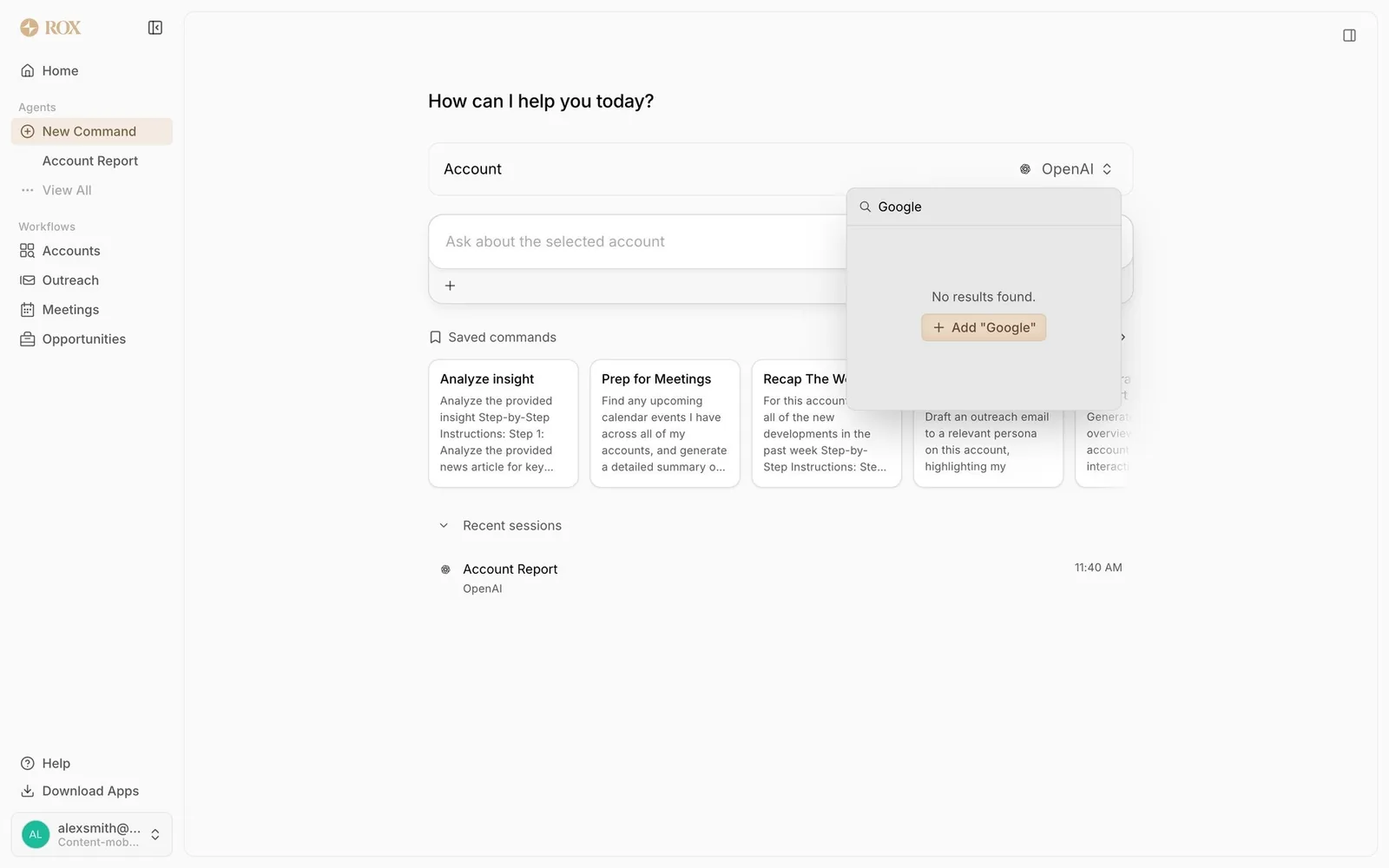
For your design system. Notice how Replit names tiers by cost and effort, and hides model names one level deeper. That's a content design decision worth copying.
09. Context-window and cost meter
Context used, tokens and dollars are shown as a status line or meter, so users know when to compact the context or start fresh.
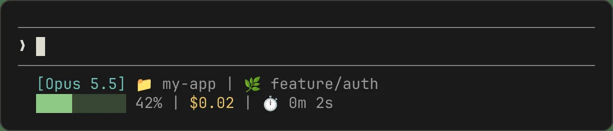
For your design system. This is a Progress bar with a new meaning. Agree on thresholds and colors (when does 70% turn into a warning?) so every product shows the same thing.
10. Voice mode orb and live transcript
A full-screen animated orb for real-time speech, with a live transcript and a big Stop button you can use to interrupt.

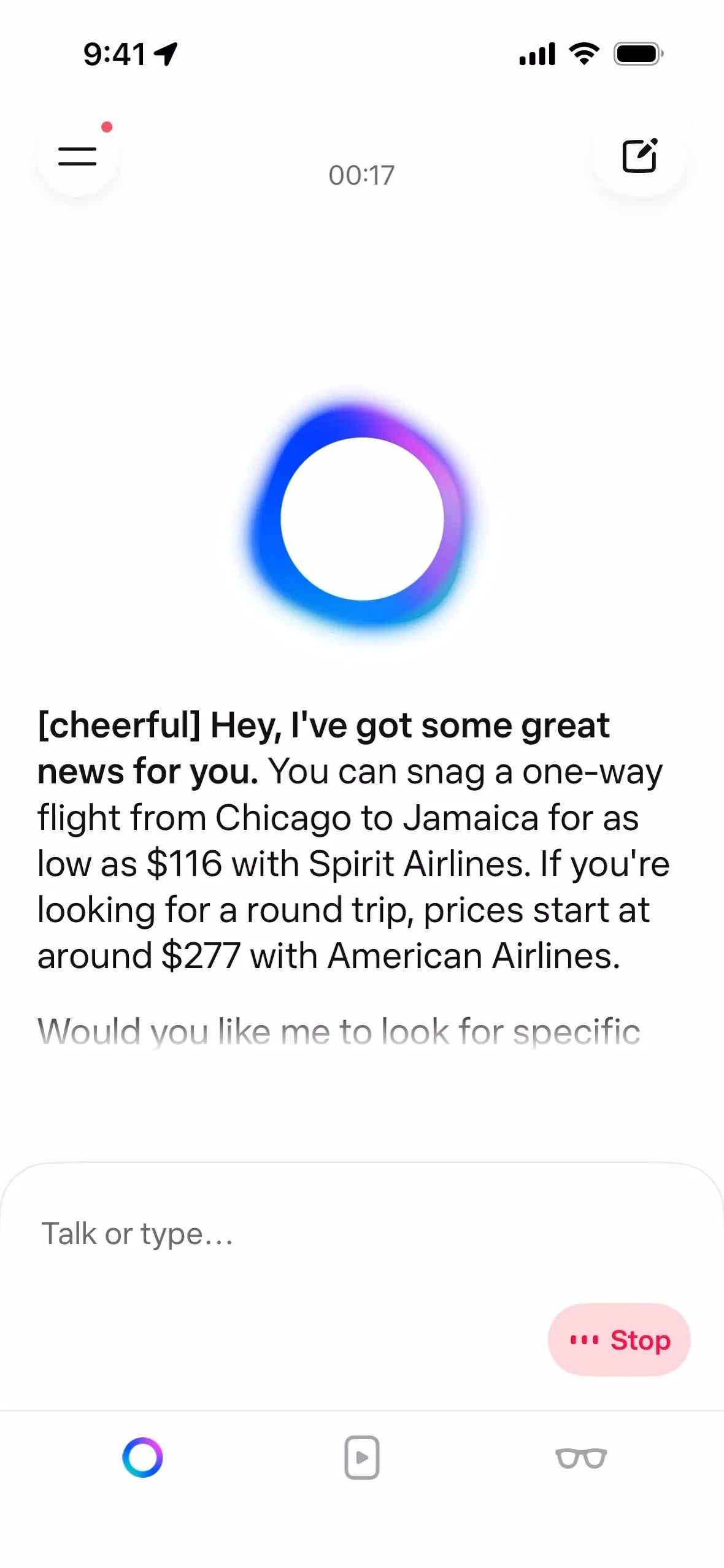
For your design system. Motion tokens matter here. The orb's states (listening, thinking, speaking) are carried mostly by animation, and that needs a reduced-motion version.
Agent transparency: showing the work
Agents now run for seconds to hours, so the UI streams a plan, every tool call and the reasoning, letting users follow along, trust the result and interrupt.
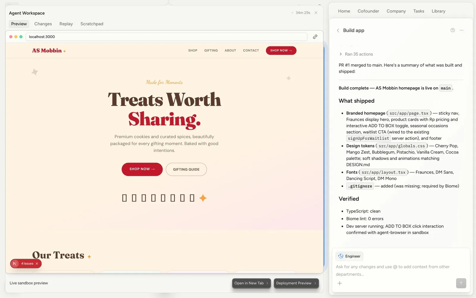
11. Live plan / to-do checklist
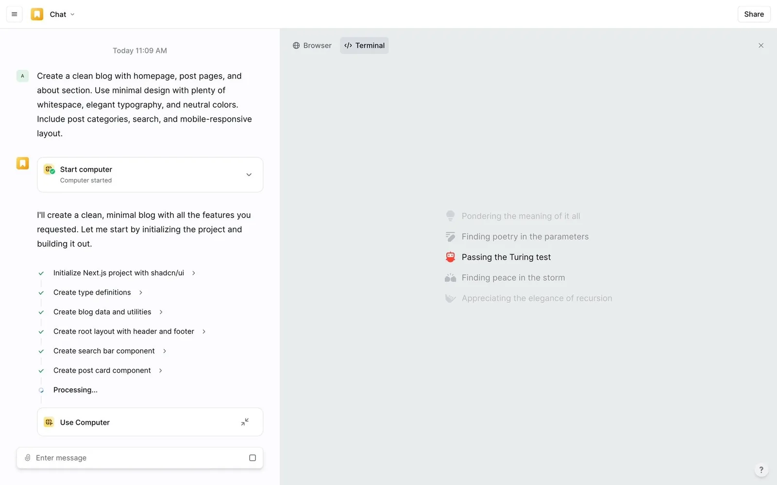
The agent writes a step list up front and ticks items off as it goes (“2 of 6 completed”). The same pattern appears in web apps and terminals.
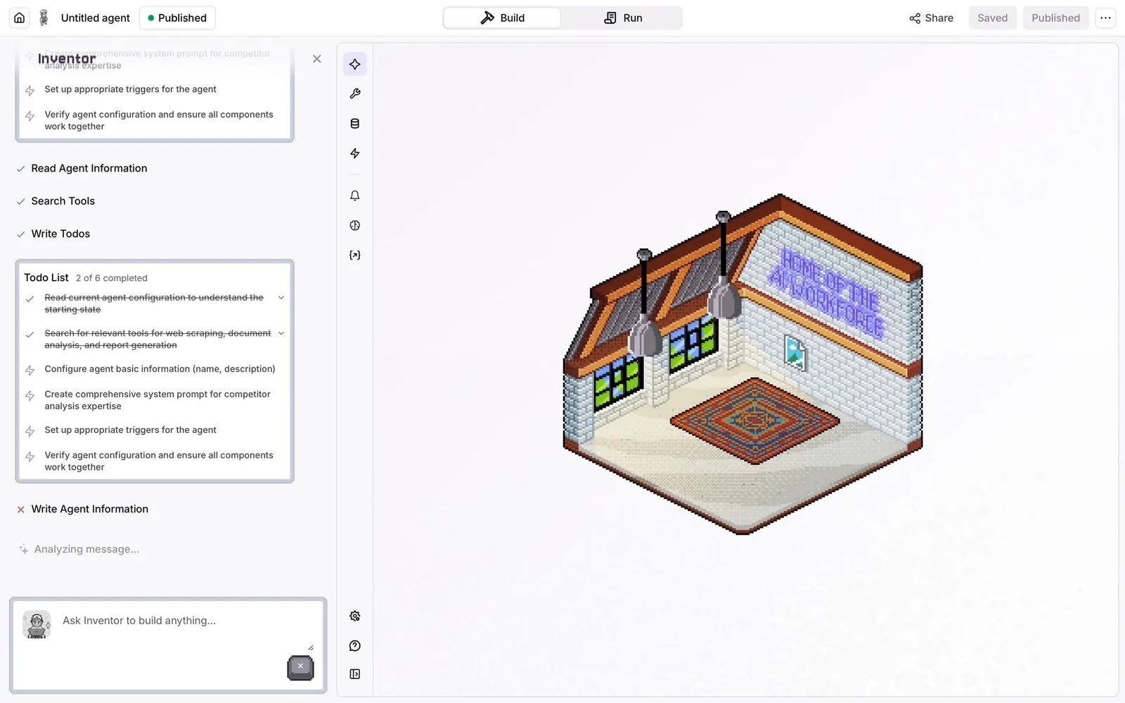
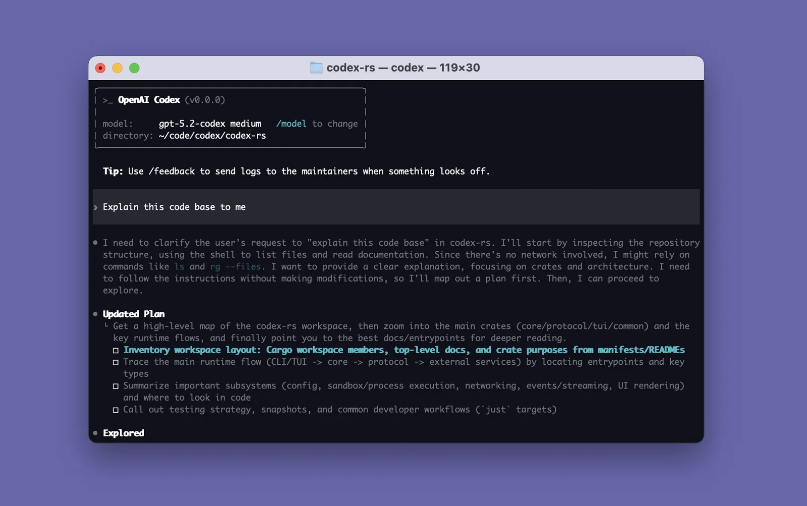
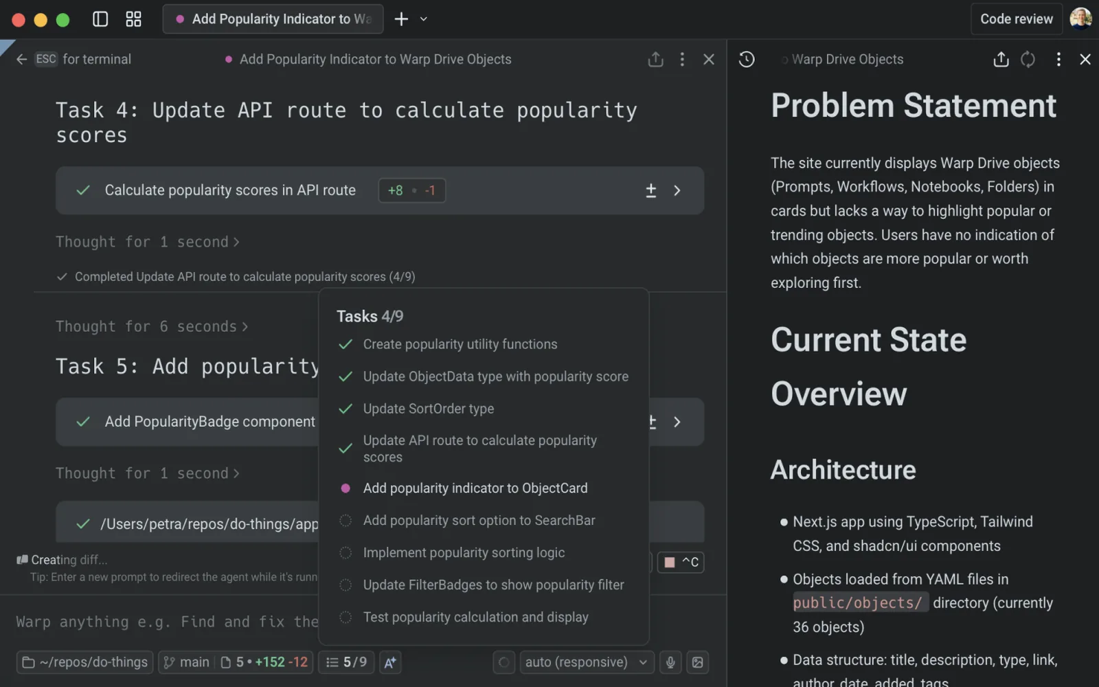
For your design system. If you build one new component this quarter, I'd build this one. It's a Checklist with four states per item (pending, in progress, done, skipped or failed) and a summary line. Simple to spec, and it shows up everywhere.
12. Collapsible tool-call / action log rows
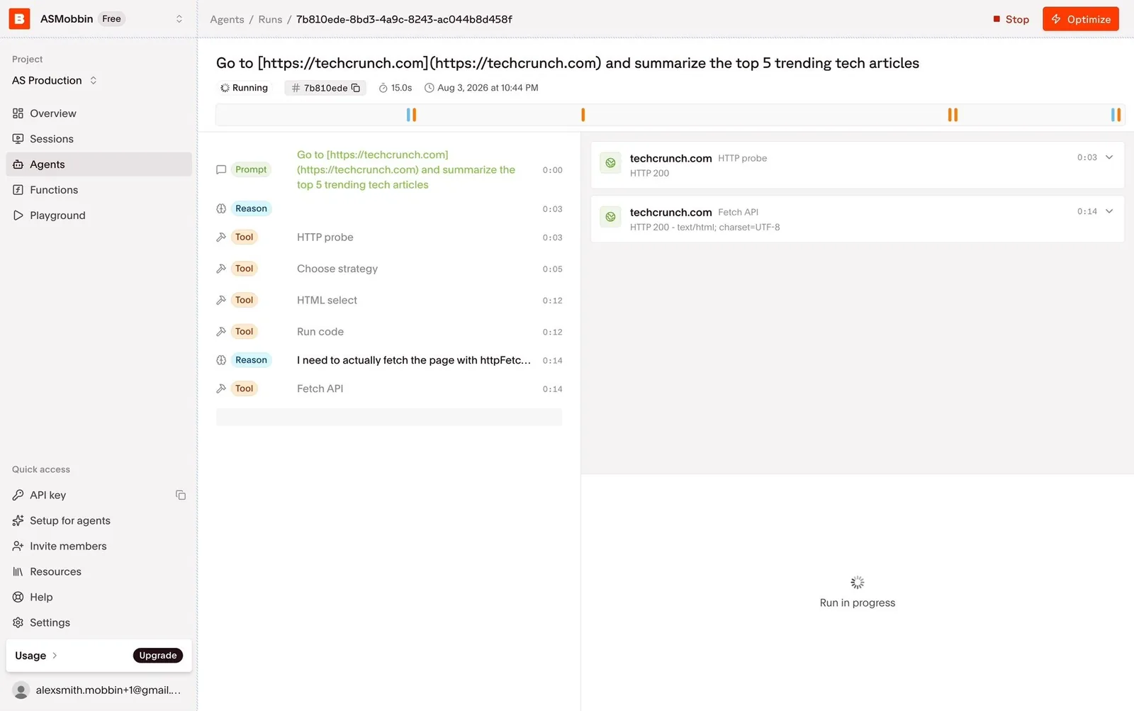
Each action becomes a compact row (“Viewing 7 paths”, “Edited .env”, “Created 1 file”, “Task created”) that you can expand for detail. In terminals, ctrl+o expands it.
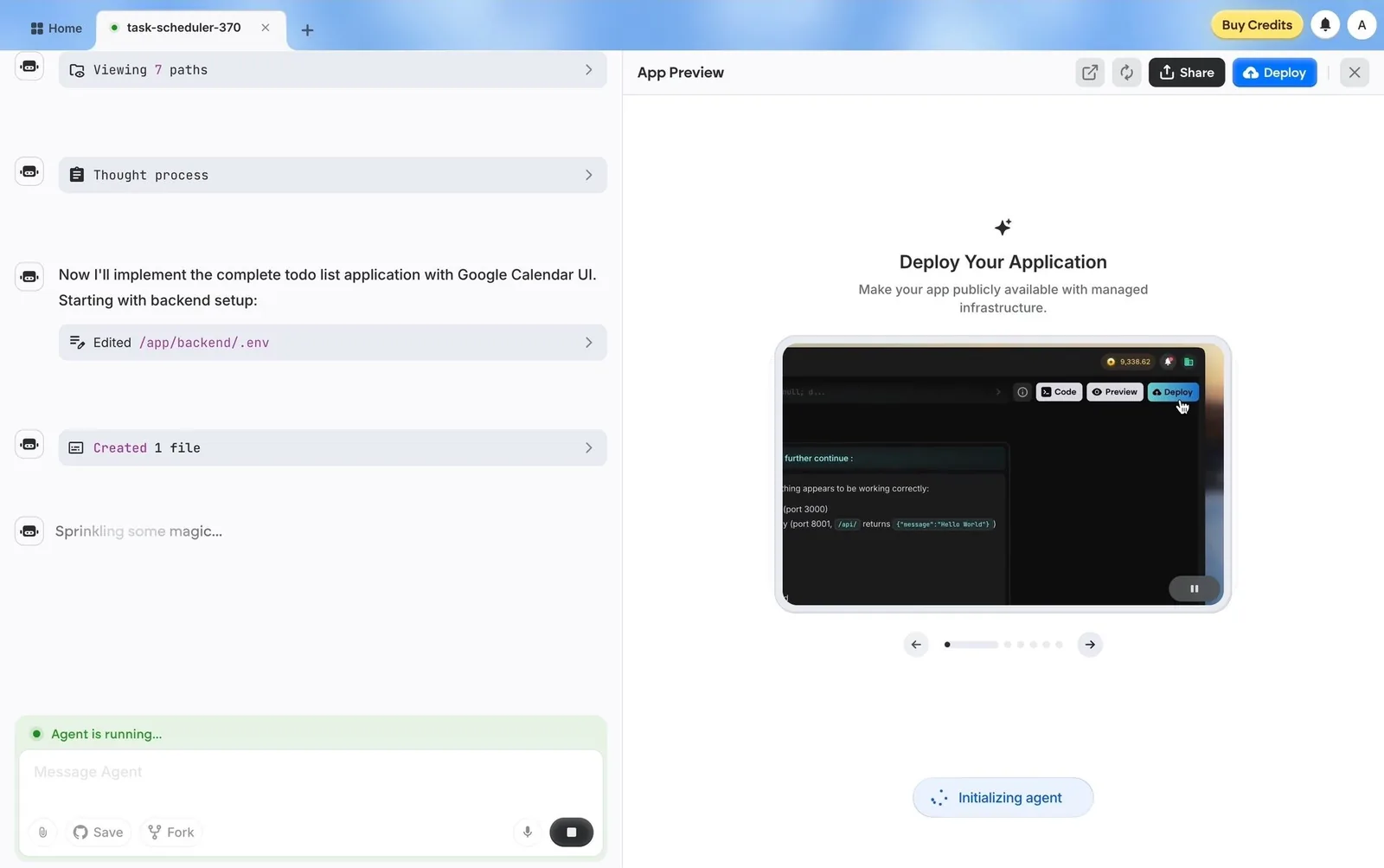
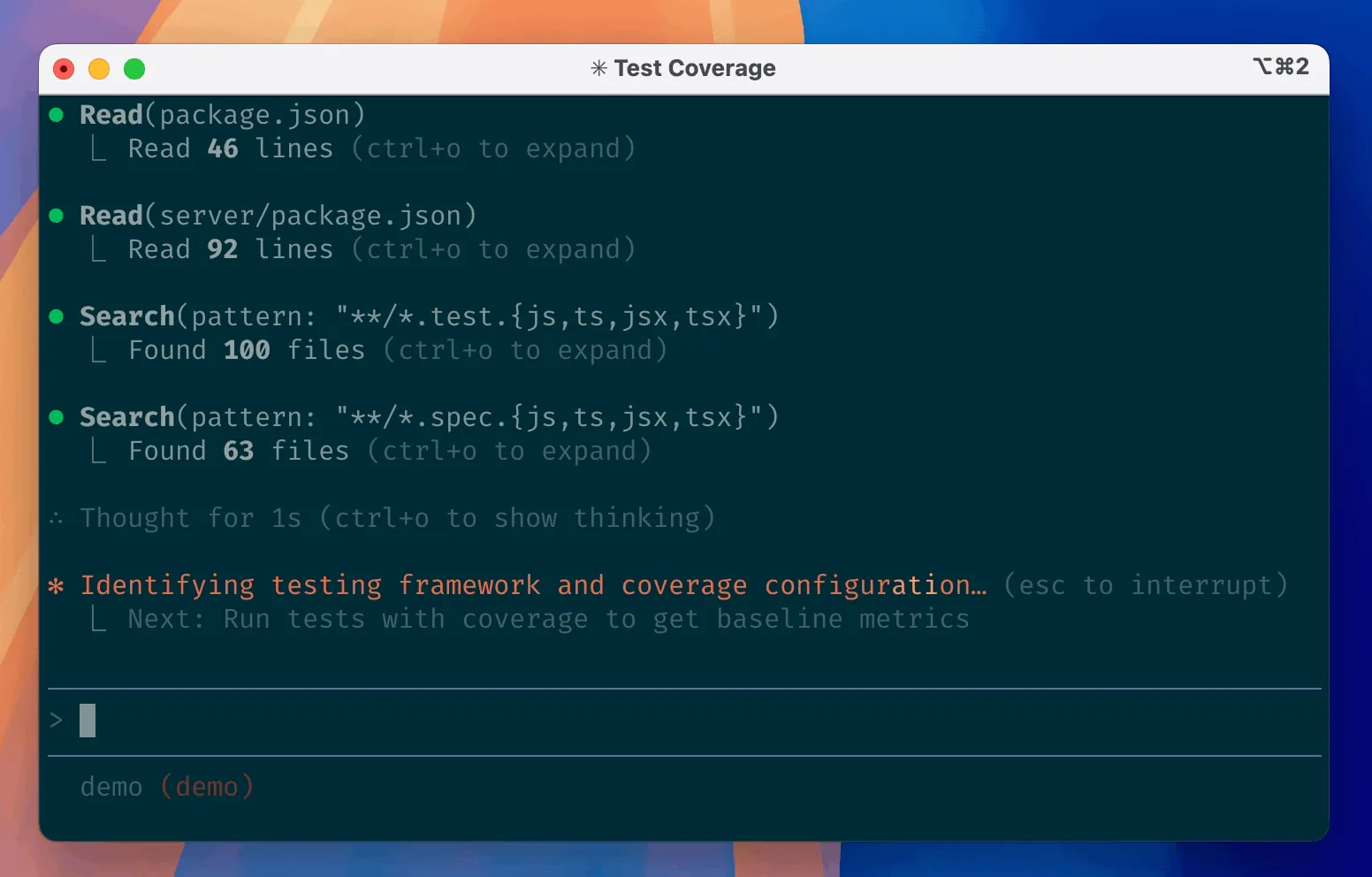
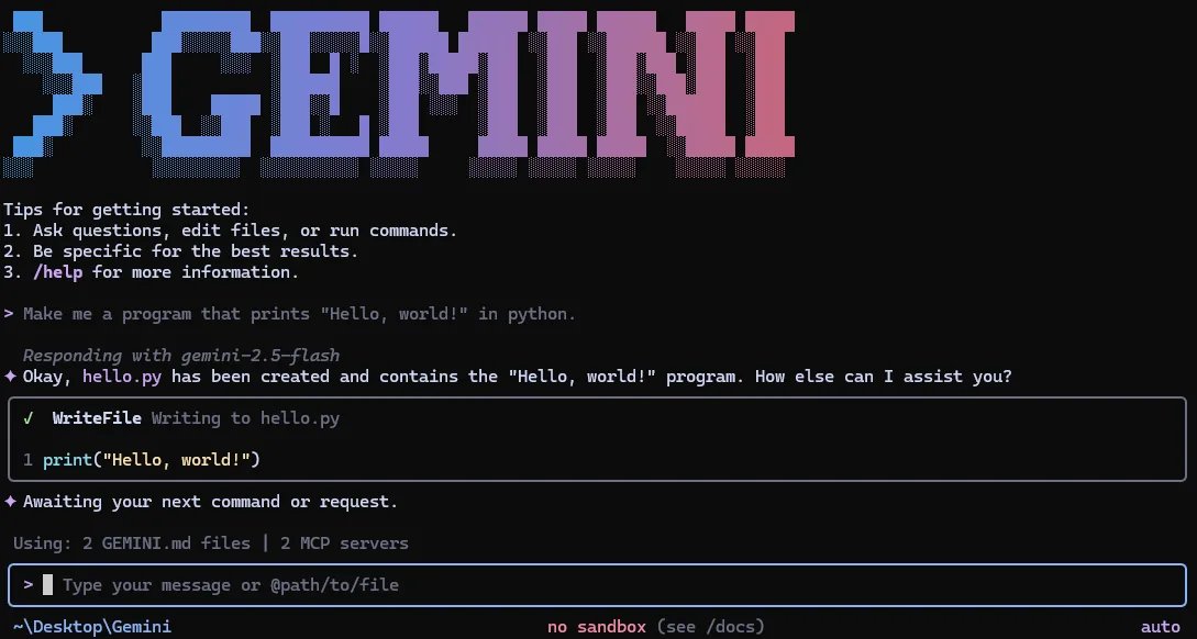
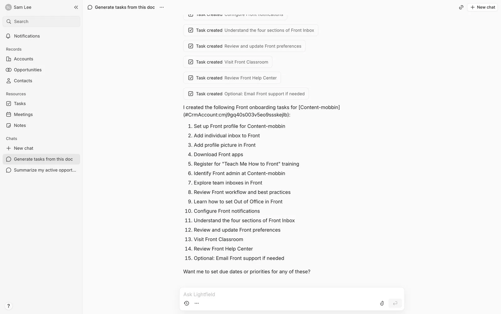
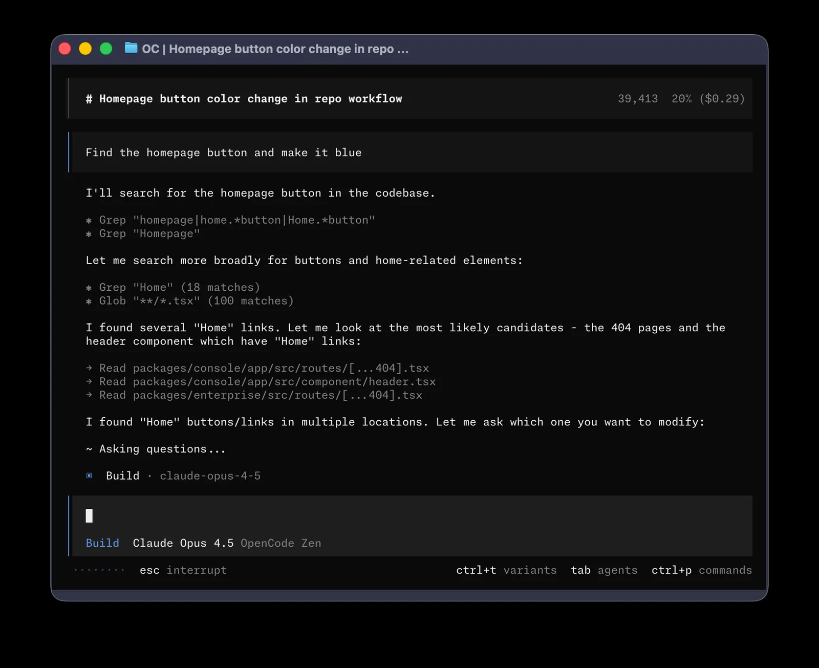
For your design system. The hard part is the writing. "Edited 1 file" is useful. "Called tool: file_write" is noise. Put the verb list in your content guidelines (Viewing, Searching, Edited, Created, Ran) so every team writes rows the same way.
13. “Thought for N s” thinking disclosure
Reasoning is collapsed behind a timer label (“Thought for 42s”, “Show thinking”). It signals effort without dumping chain-of-thought on the user.
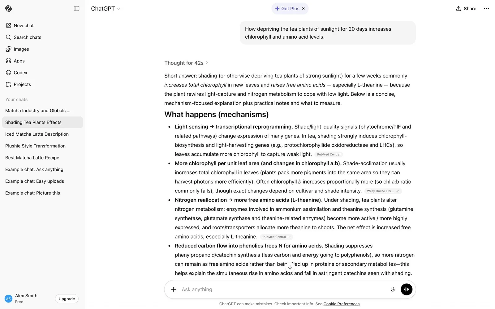
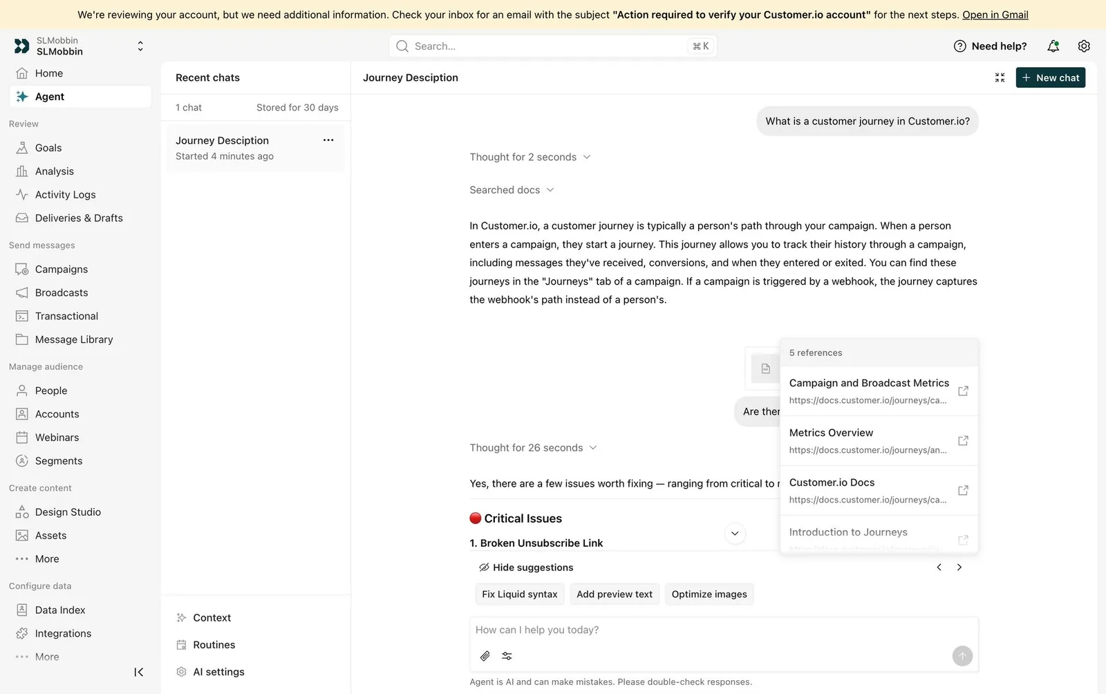
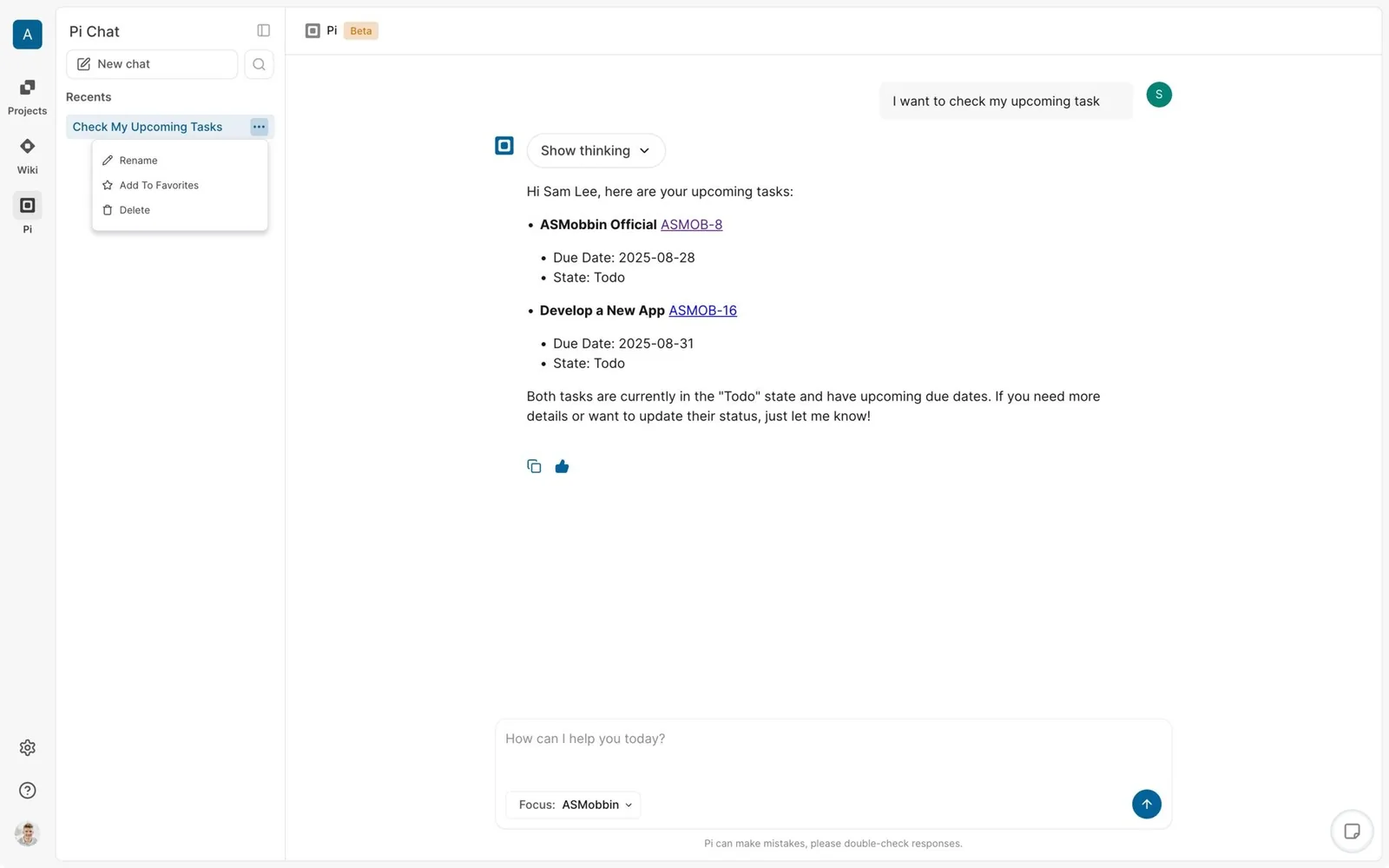
For your design system. Technically, this is a Disclosure (or Accordion) with a live timer in the label. You likely have 80% of it already.
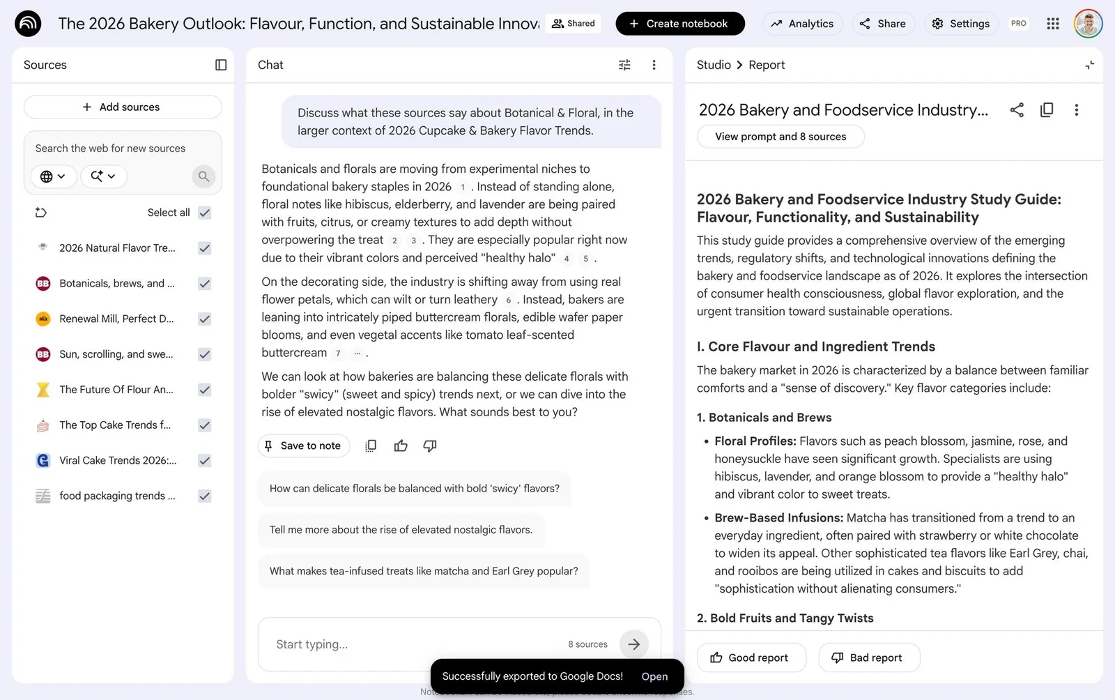
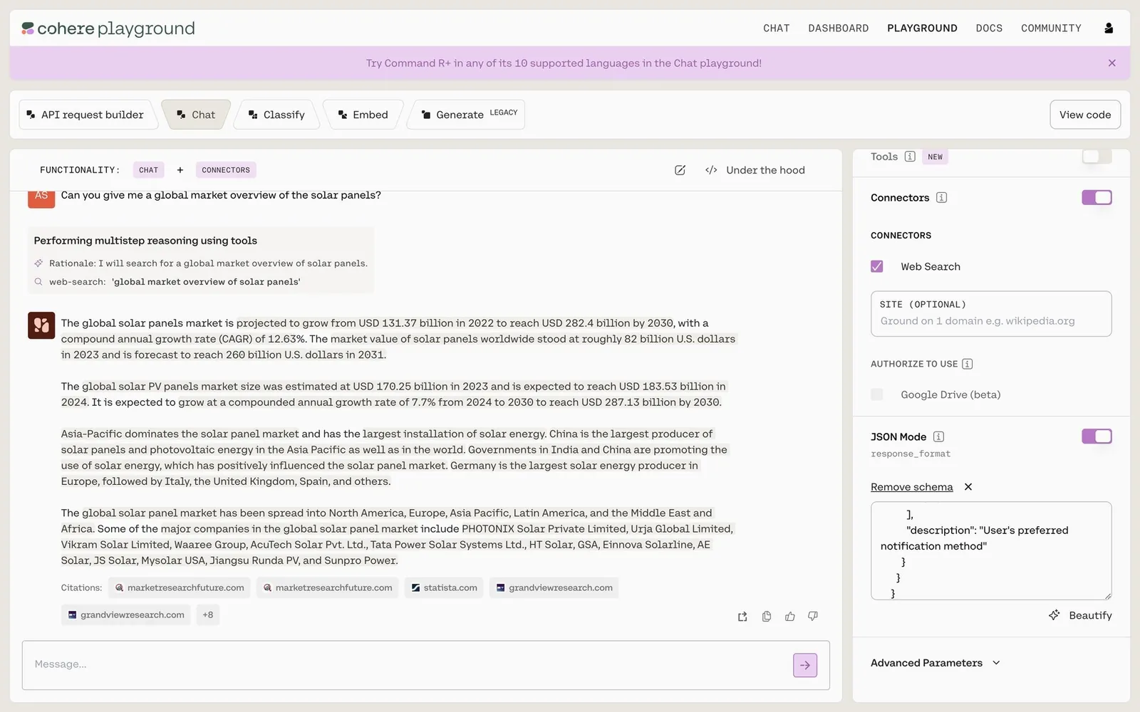
14. Inline citations and sources panel
Answers carry source pills or numbered citations, often with a side panel listing every source. This grounds the answer and lets users verify it.
15. Deep-research activity feed
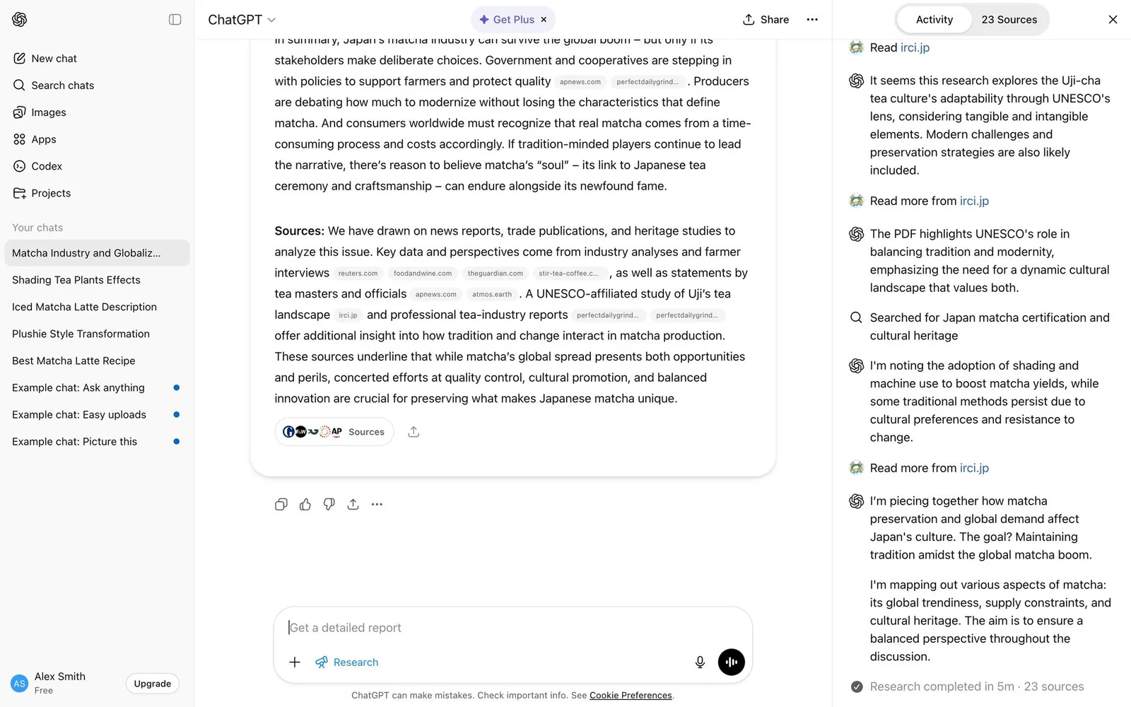
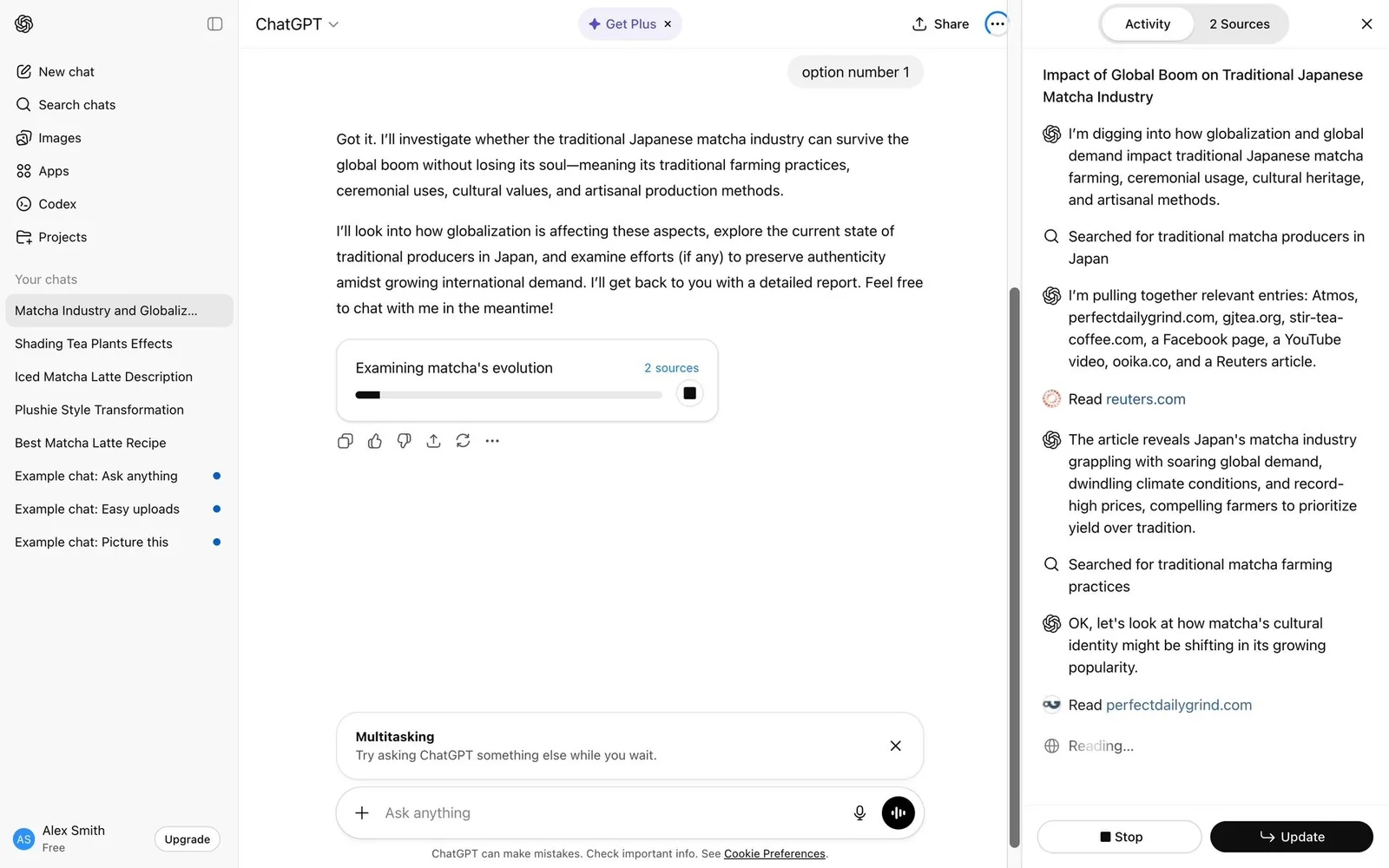
A long-running research job streams an Activity timeline of searches and readings with a source count, ending with “Research completed in 5m” and a report.
16. Playful status verbs with an interrupt hint
Whimsical rotating gerunds (“Grooving…”, “Sprinkling some magic…”, “Pondering the meaning of it all”) paired with hard data: elapsed time, tokens, and “esc to interrupt”.
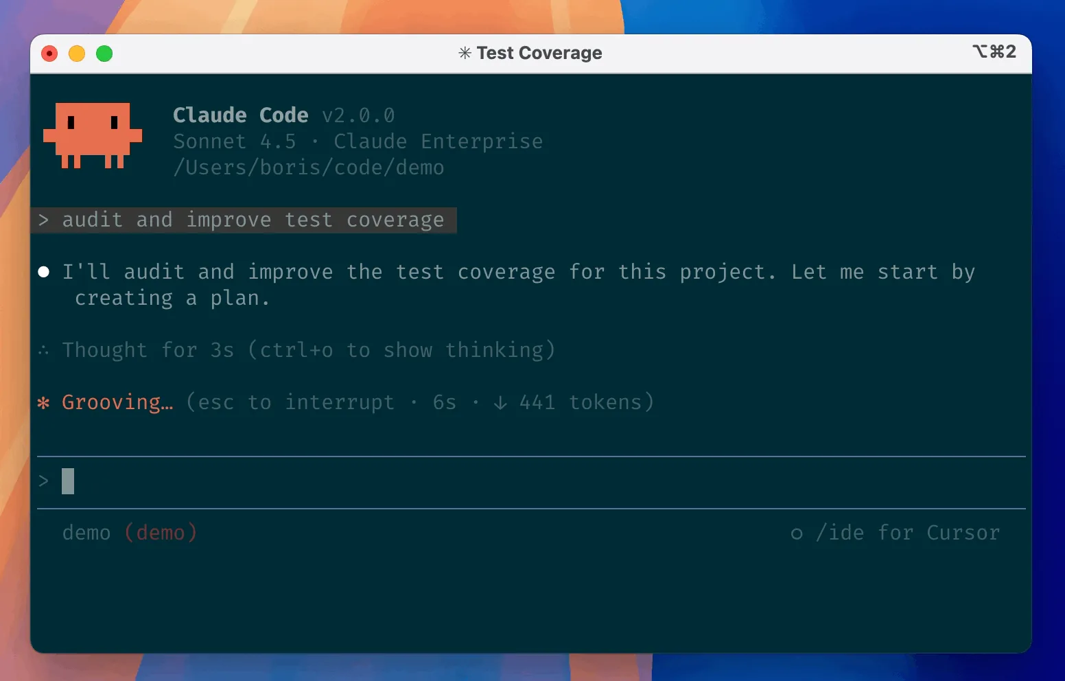
For your design system. I love this one because it's personality plus control. The joke keeps you company during a long wait, and the interrupt hint right next to it tells you how to stop the agent.
17. Agent's computer pane, run trace and replay
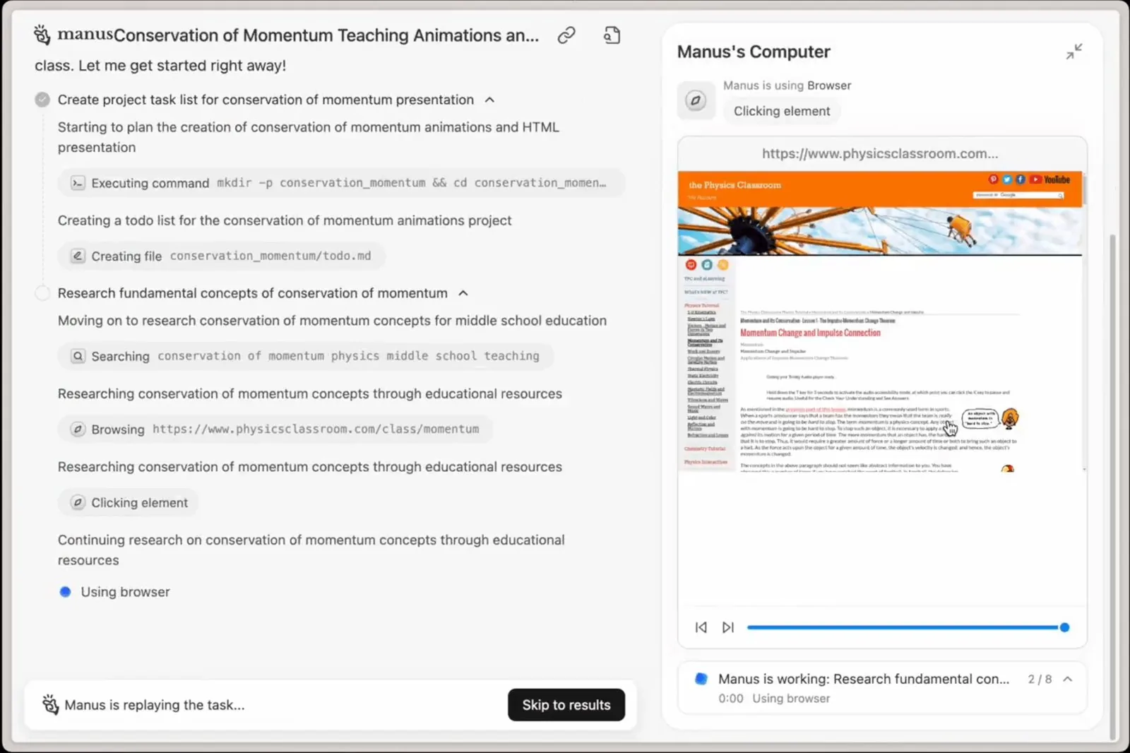
A live window into the agent's own browser or terminal, plus a scrubbable replay or timestamped trace of every step after the run.
Human in the loop and autonomy controls
How much the agent may do without asking is now a first-class UI decision, with approvals, questions, modes and takeover.
18. Scoped approval prompt (“Yes, and don't ask again”)
Before a risky action, the agent shows the exact command or diff and offers Yes once, Yes always for this pattern, an escalation to a more autonomous mode, or No (Tab to amend).
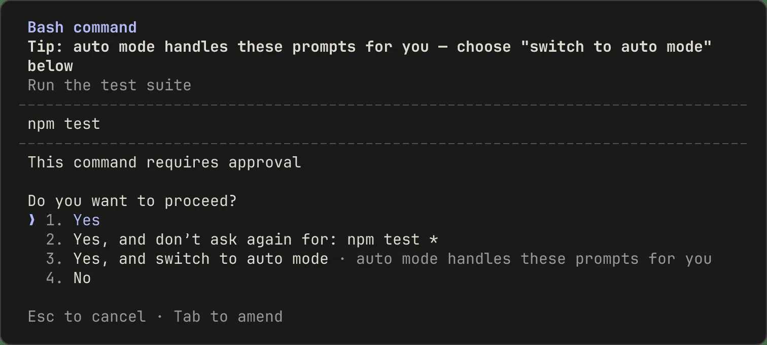
For your design system. The detail I'd steal: "don't ask again" is scoped to a pattern (
npm test *). It doesn't unlock everything. Your Confirmation dialog probably has two buttons. This one needs a scope line and a preview of the action.
19. Structured clarifying questions
Instead of guessing, the agent pauses with a form-like card (radio options, numbered choices, Submit/Reject) and lists it in a “Pending approval” queue.
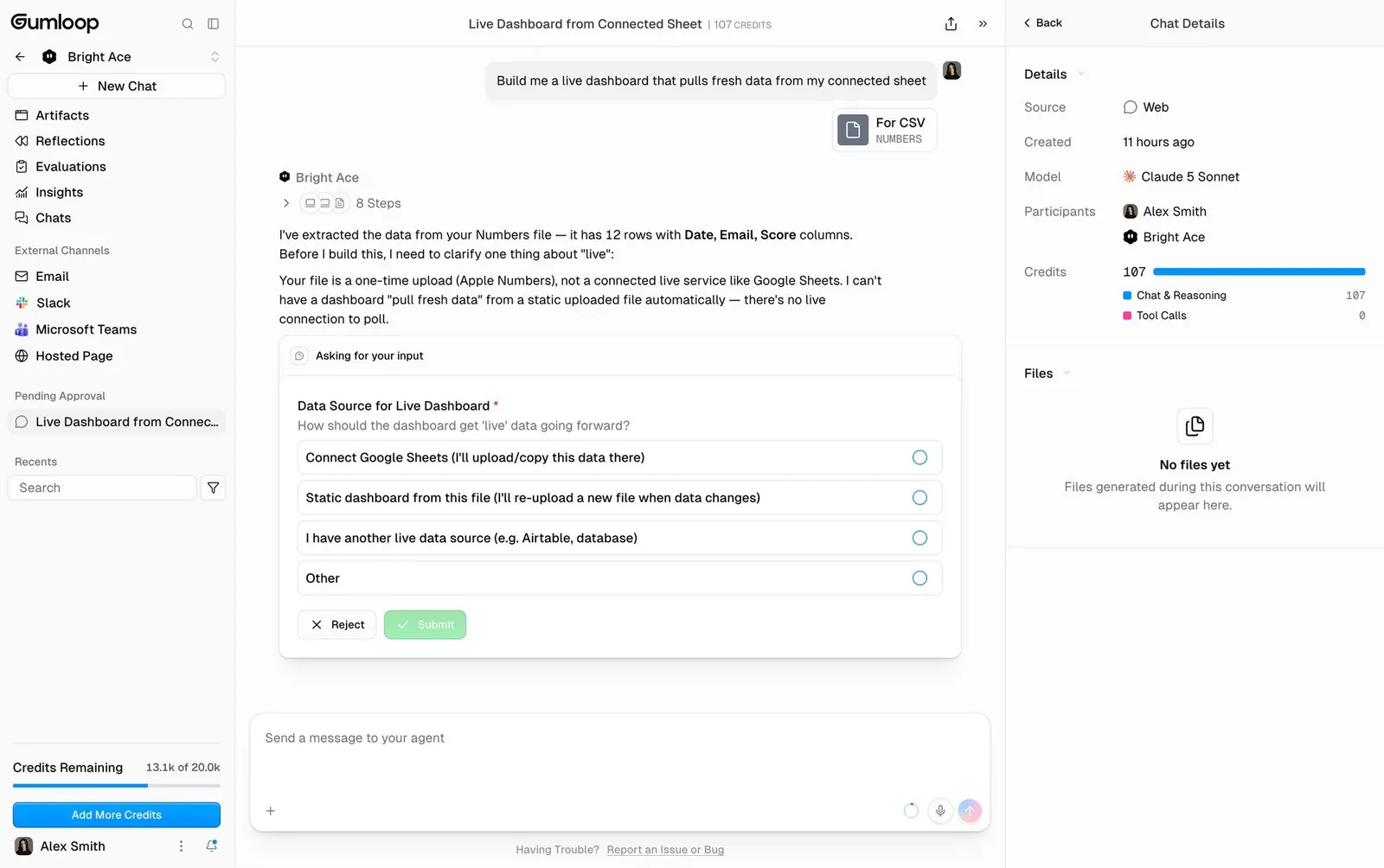
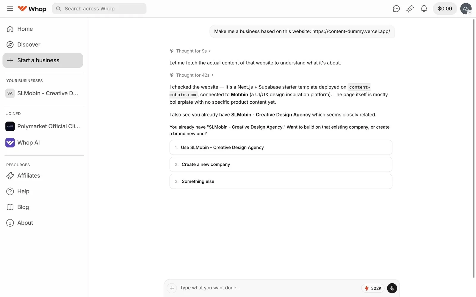
For your design system. Good news: this is built from components you have (Radio group, Card, Button). What's missing is a documented pattern for "form inside a conversation", including what happens to the card after it's answered.
20. Autonomy modes: plan mode / accept edits / auto
One keystroke (Shift+Tab) cycles how autonomous the agent is. Plan mode means read-only planning, and a status-bar label always shows the current mode.
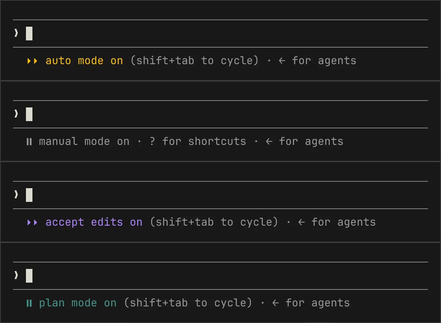
For your design system. The mode label needs to be visible all the time. If I can't tell at a glance whether the agent is in "auto", I shouldn't walk away from my laptop.
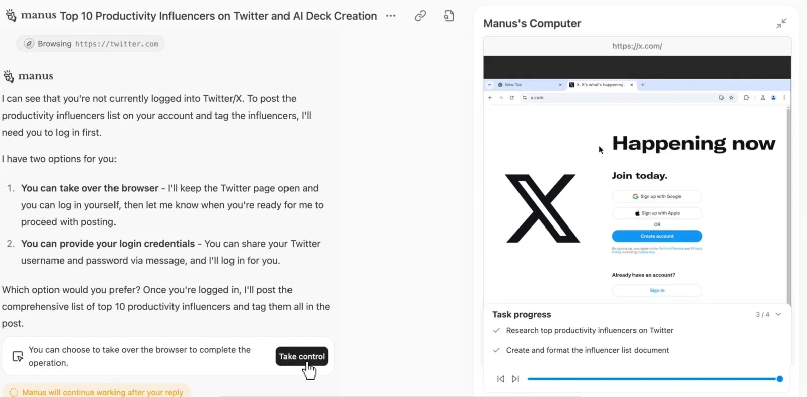
21. Take control of the agent's browser
The user watches the agent operate a remote browser and can press “Take control” to handle a login, CAPTCHA or payment, then hand control back.
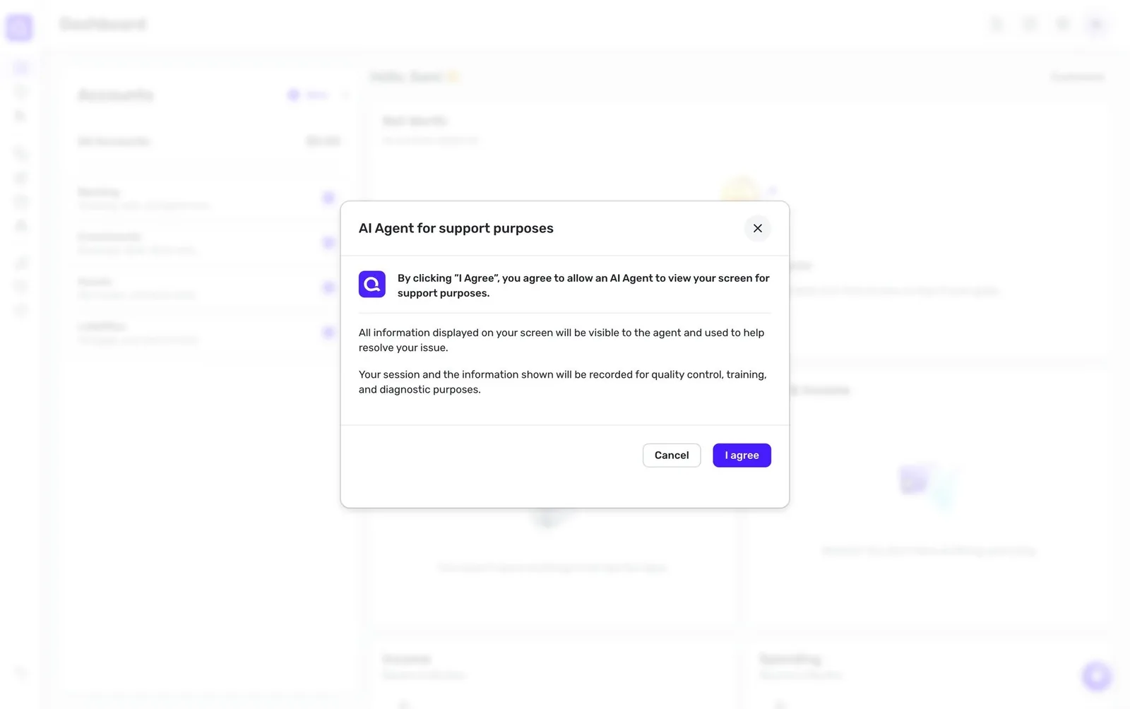
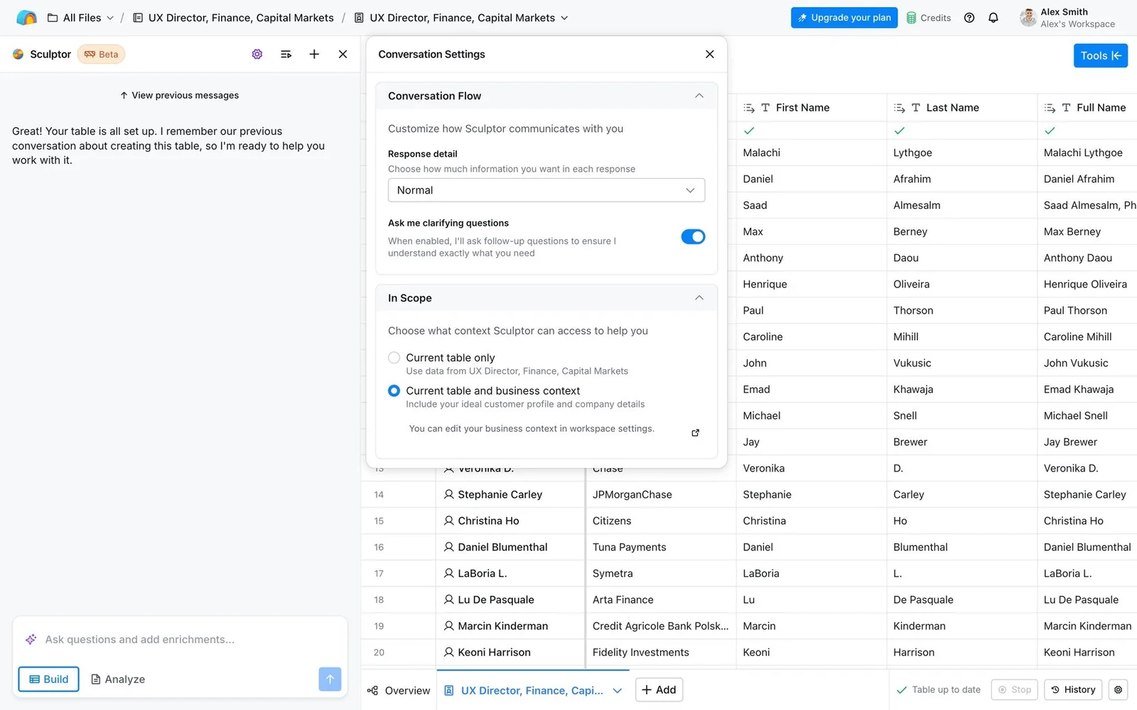
22. Agent consent and behaviour settings
Explicit consent before an agent sees your screen or data, plus settings that tune behaviour, such as “Ask me clarifying questions”, response detail and scope.
Async, background and multi-agent
Agents run in the cloud while you do something else, and several run at once. The UI starts to look like an inbox or a CI dashboard instead of a chat.
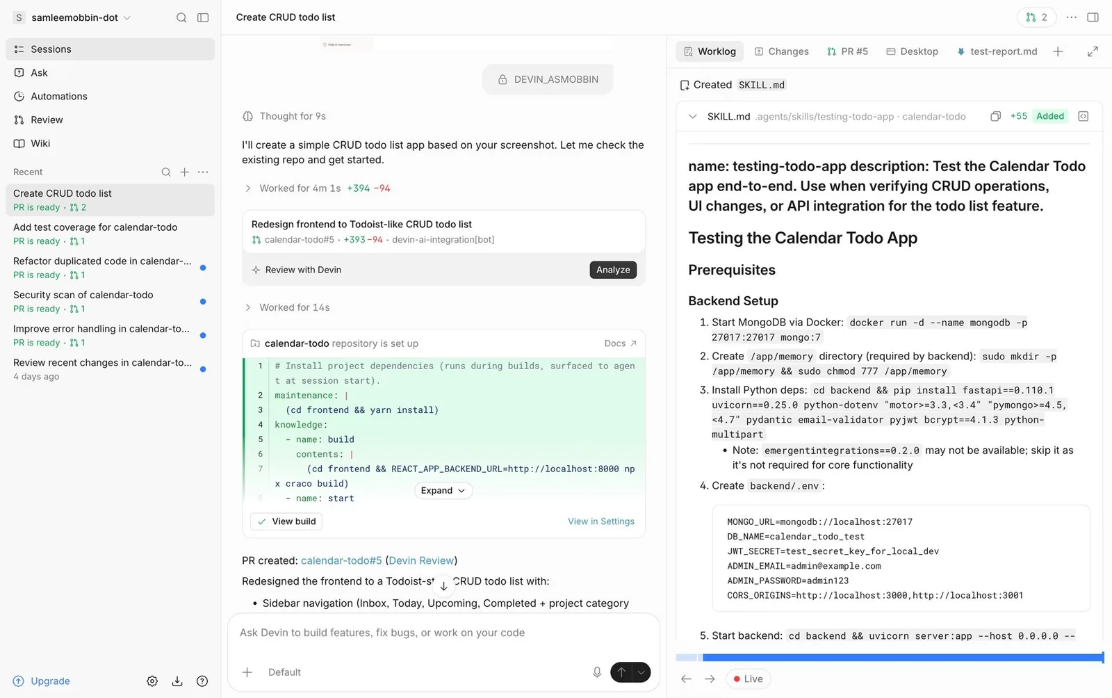
23. Background/cloud agent sessions with PR status
Fire off a task and the agent works remotely. A session list shows status (“PR is ready”), with tabs for worklog, changes, PR and the agent's desktop.
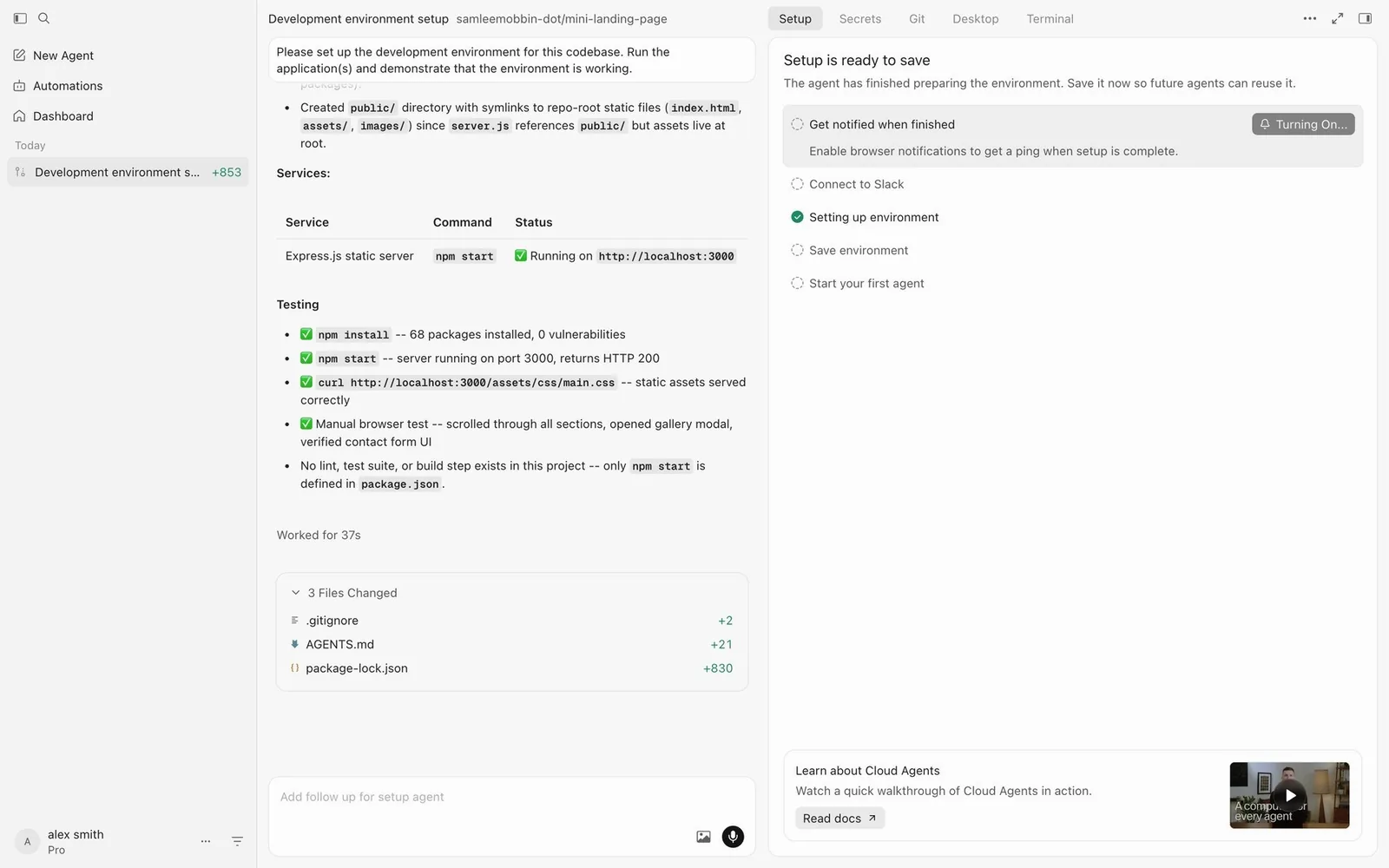
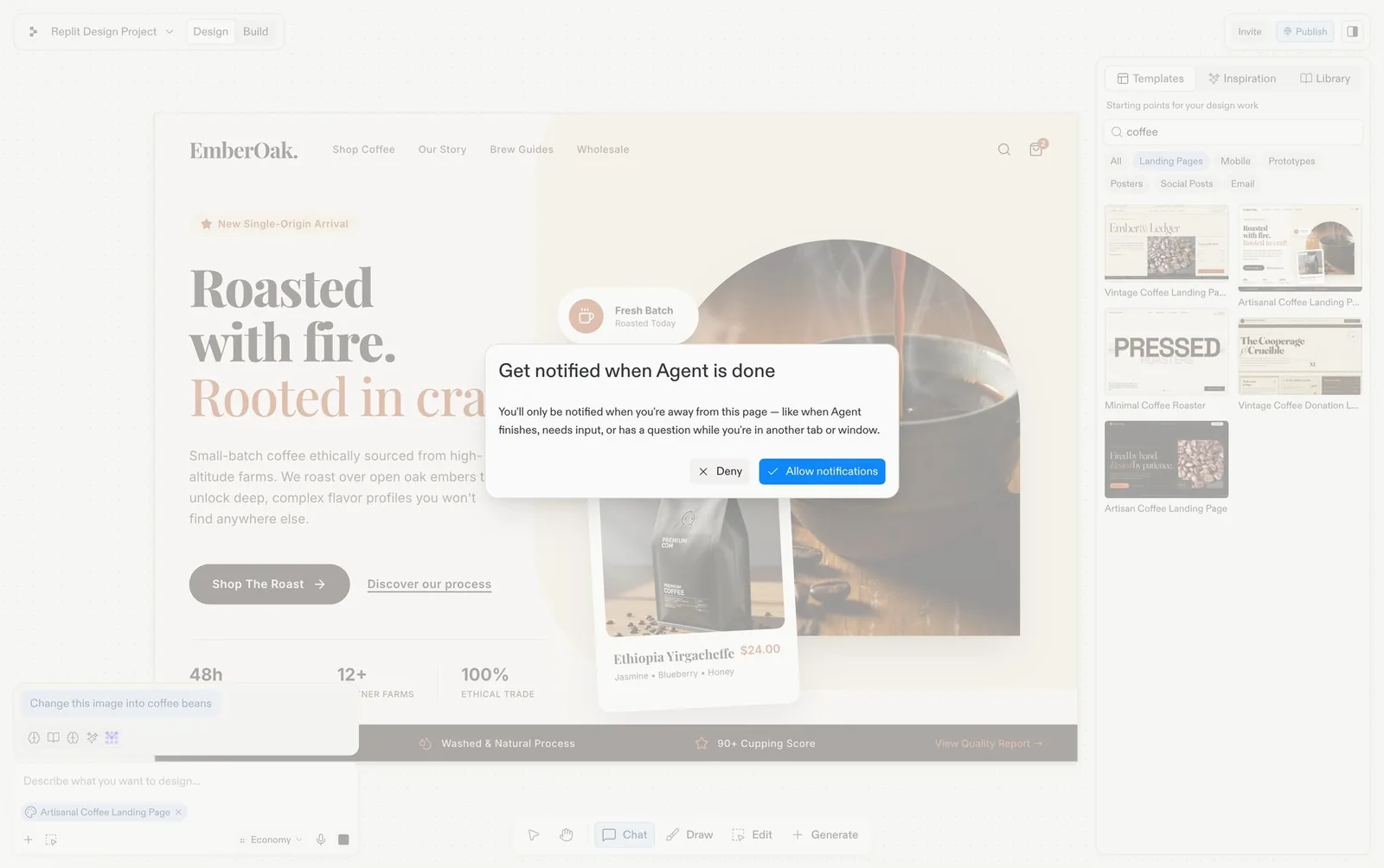
24. “Notify me when done” and multitasking
Long tasks offer a notification opt-in and explicitly invite you to keep chatting or work elsewhere while a progress card runs.
25. Agent inbox: Needs input / Working / Completed
Many parallel sessions grouped by state, so the human acts as a dispatcher and answers whichever agent is blocked.
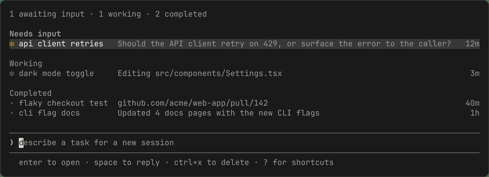
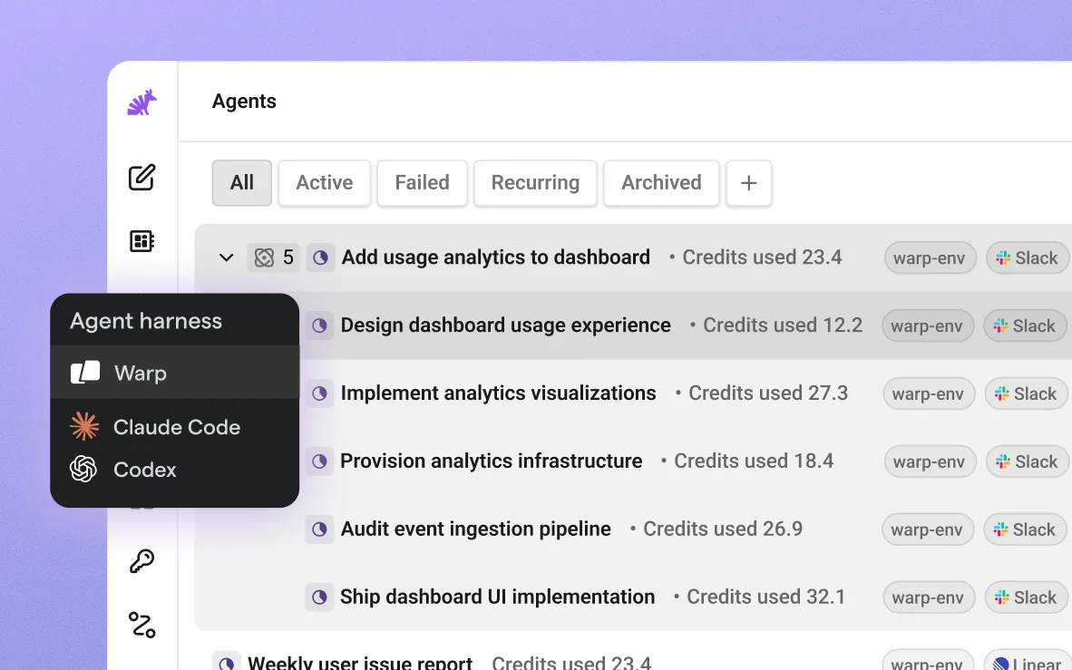
For your design system. This is a status system more than a component. "Needs input", "Working", "Completed", "Failed" should mean the same thing (same color, same icon, same words) in the inbox, the notification and the session header.
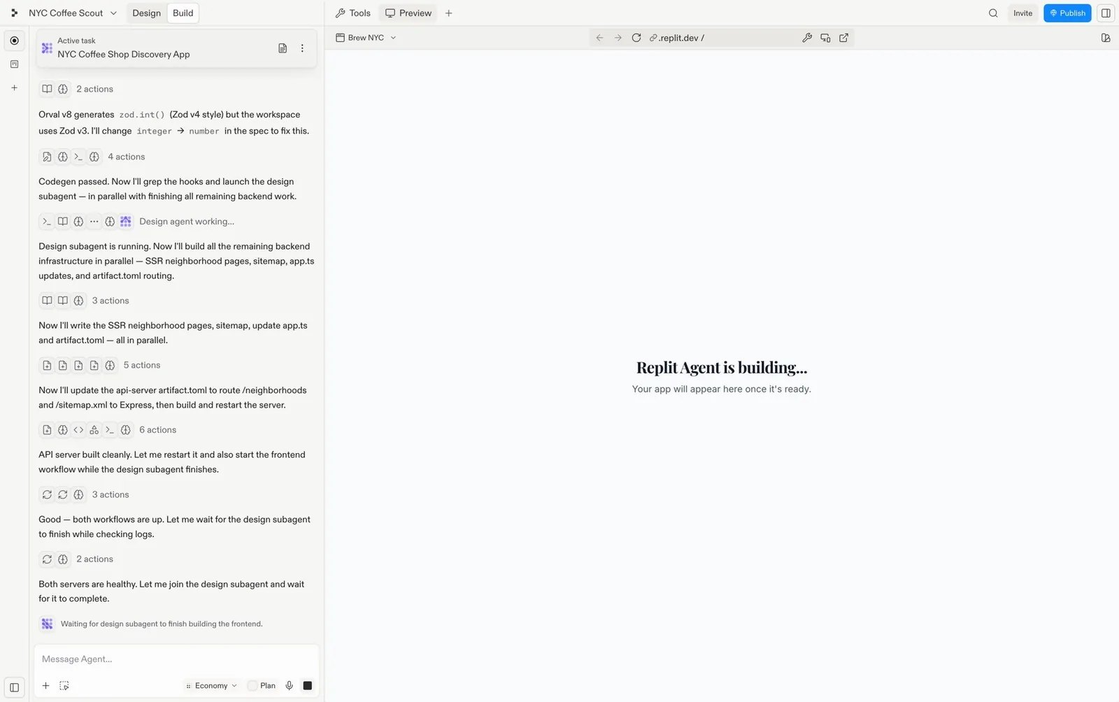
26. Subagents and harness picker
A lead agent delegates to specialised subagents (“Waiting for design subagent”). Some tools let you choose which agent harness runs a task, for example Warp, Claude Code or Codex.
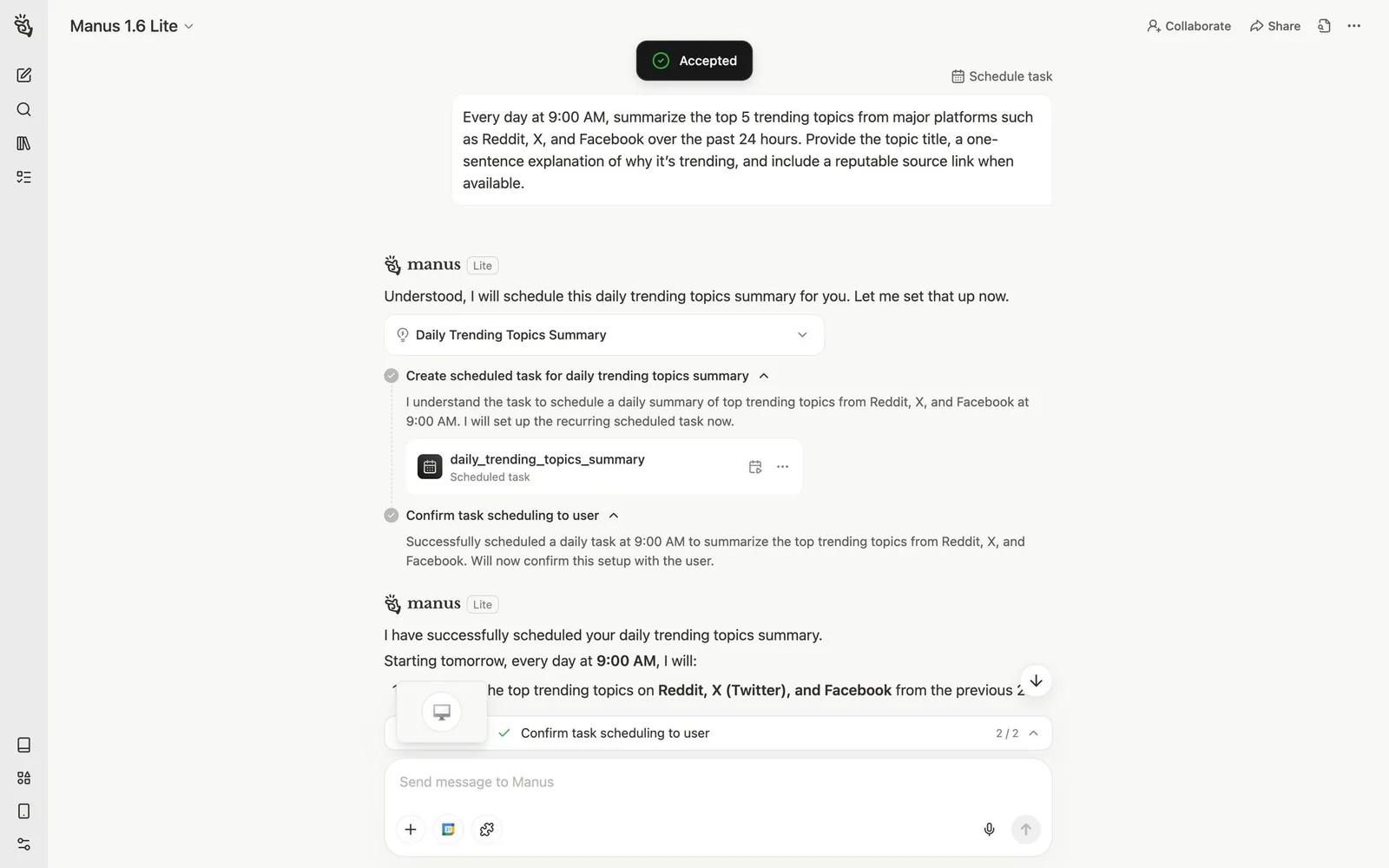
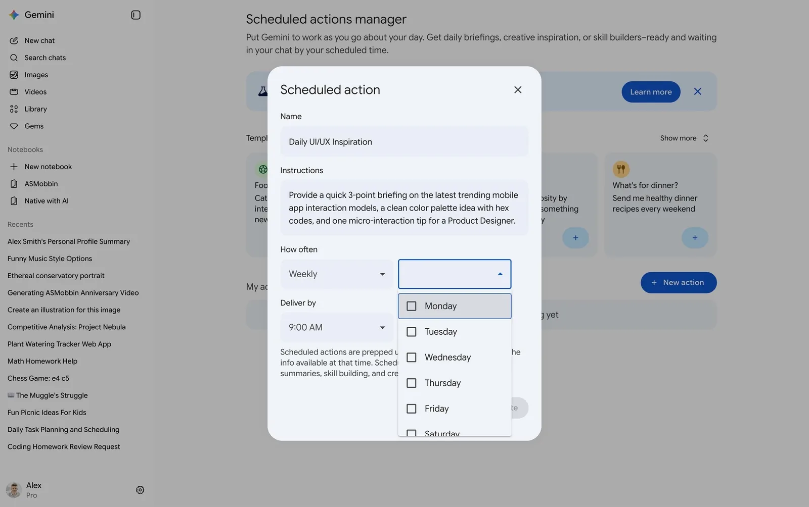
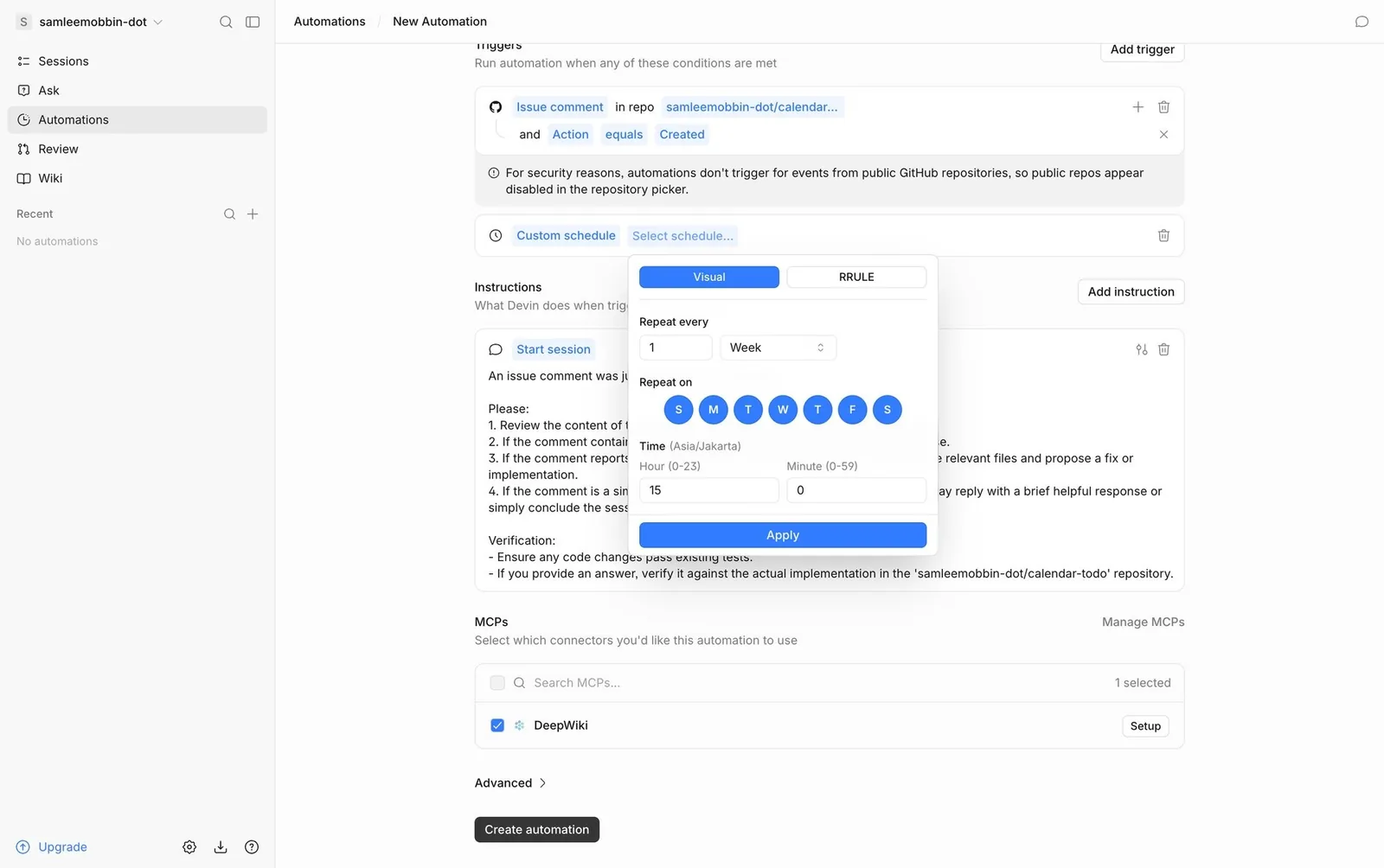
27. Scheduled actions and automation triggers
Prompts become recurring jobs: “every Monday at 9”, on an event trigger, or via MCP tools. A manager lists them all.
Outputs, generative UI and review
The result is no longer just a chat bubble. It is an editable artifact or a live widget, and agent changes get reviewed like code: per hunk, revertible, by checkpoint.
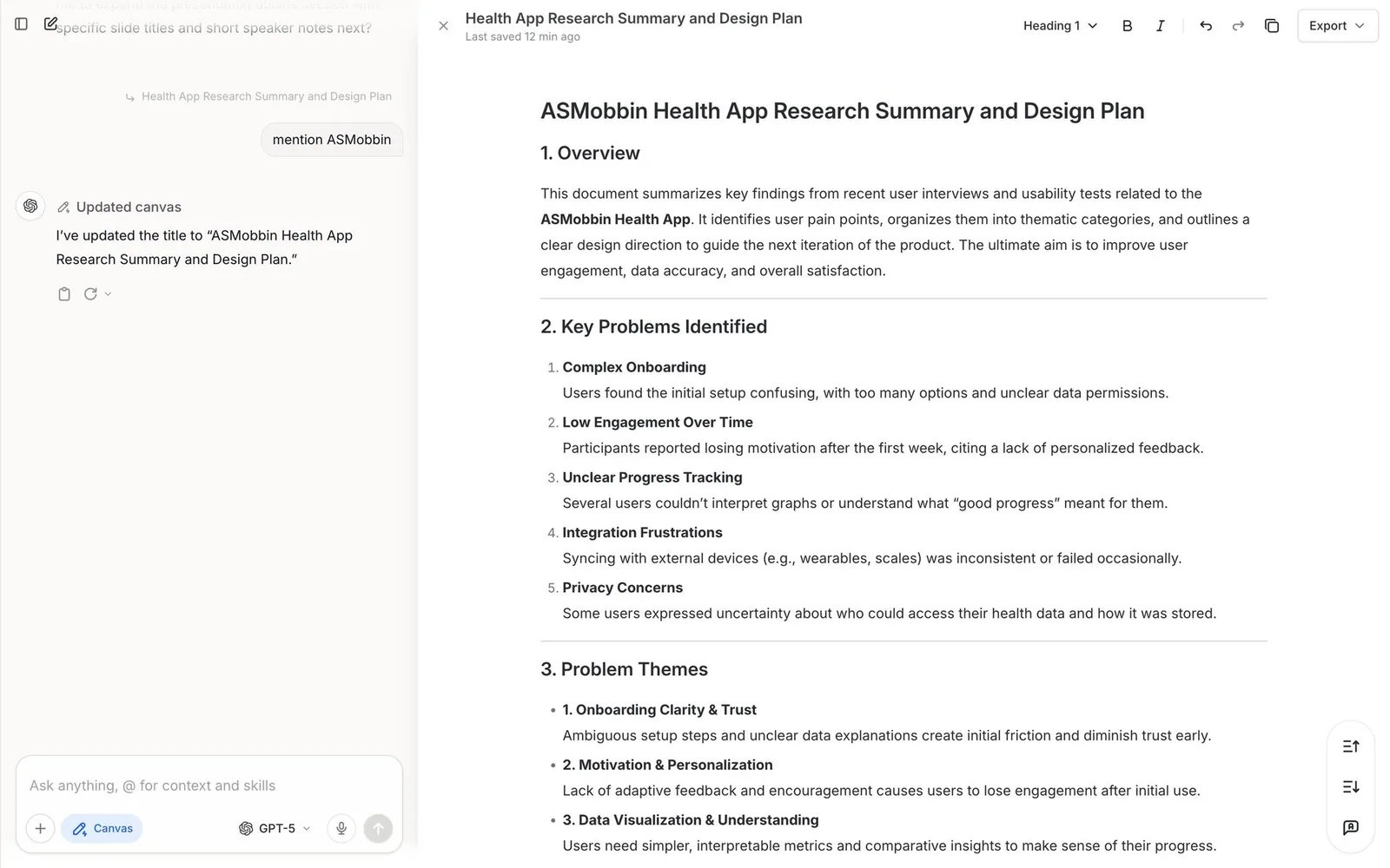
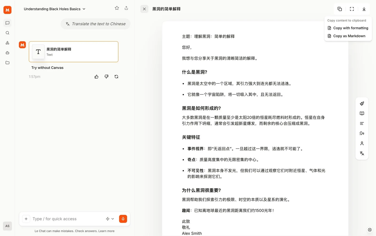
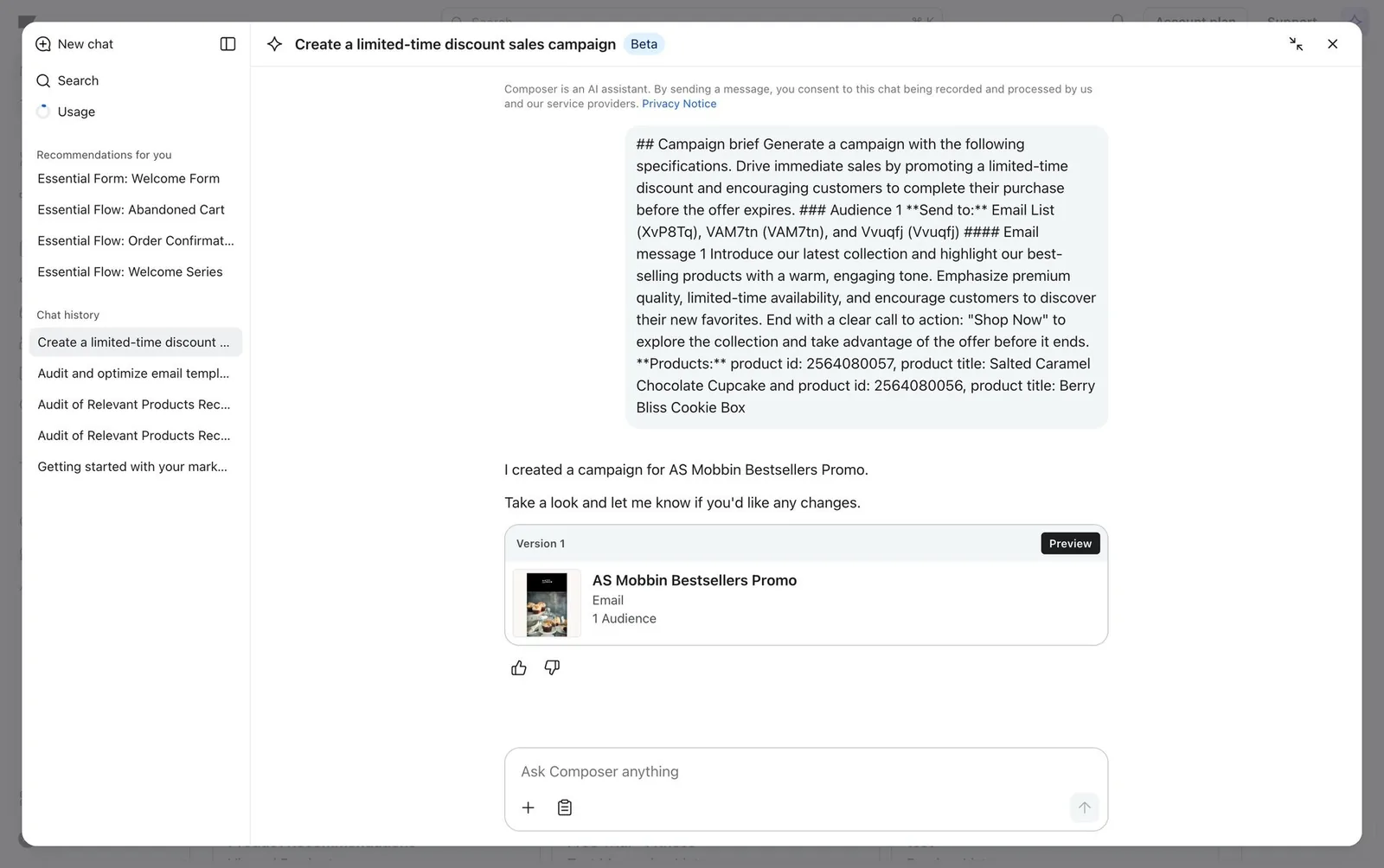
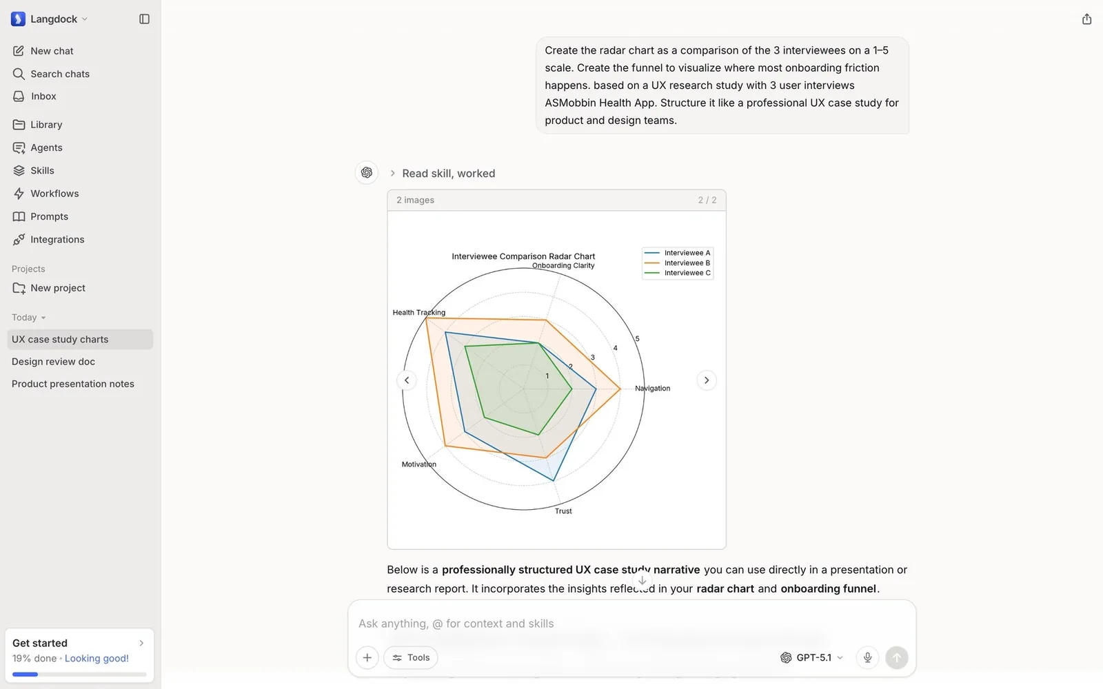
28. Canvas / artifact pane with versions
Long outputs open in a side-by-side editor next to the chat, with versions (“Version 1”, “Updated canvas”) you can edit directly.
29. Generative UI and in-chat app widgets
The model answers with interactive components (cards, carousels, maps, charts, reports with actions) instead of prose. Third-party apps can now render widgets inside ChatGPT.
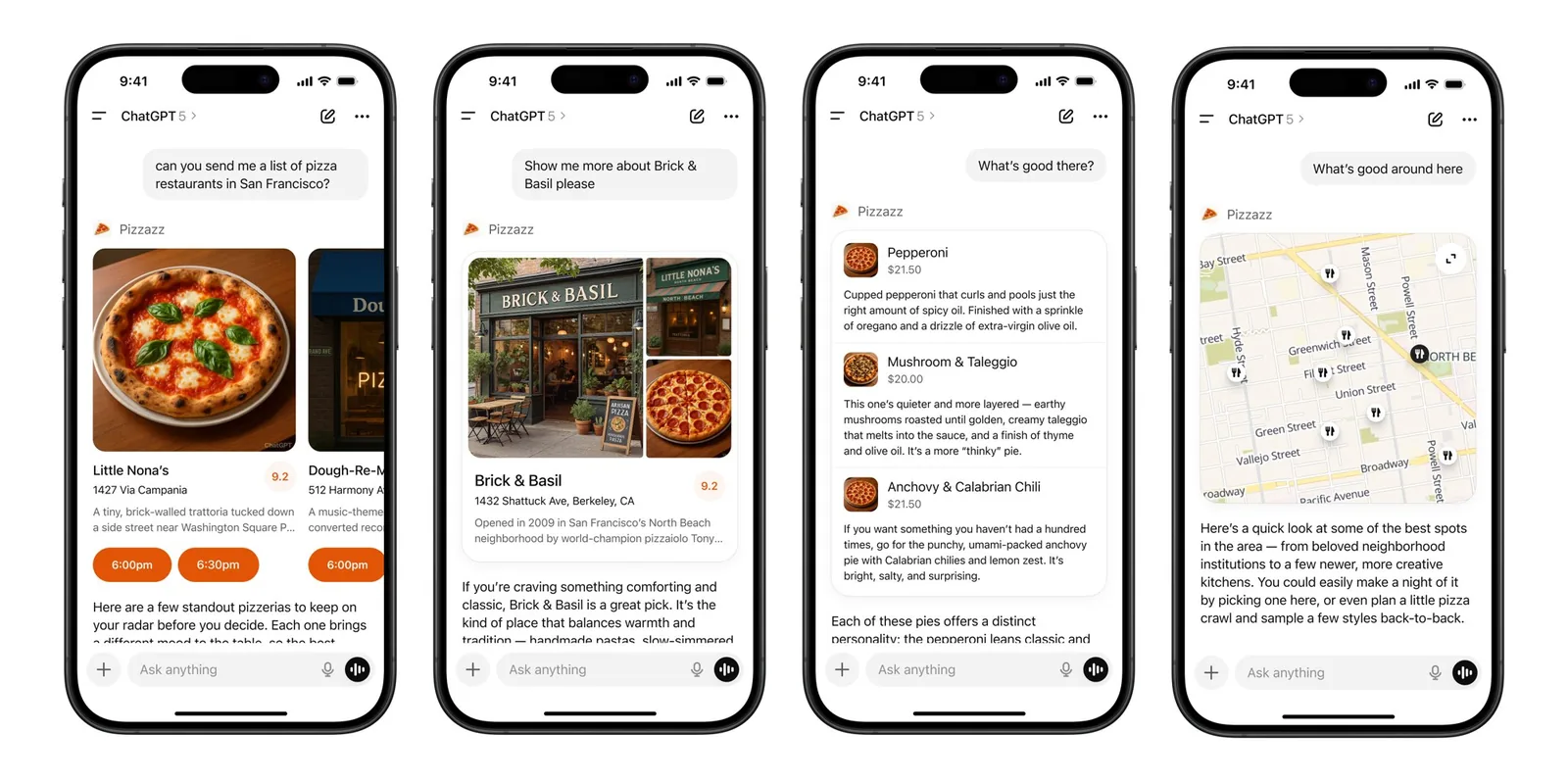
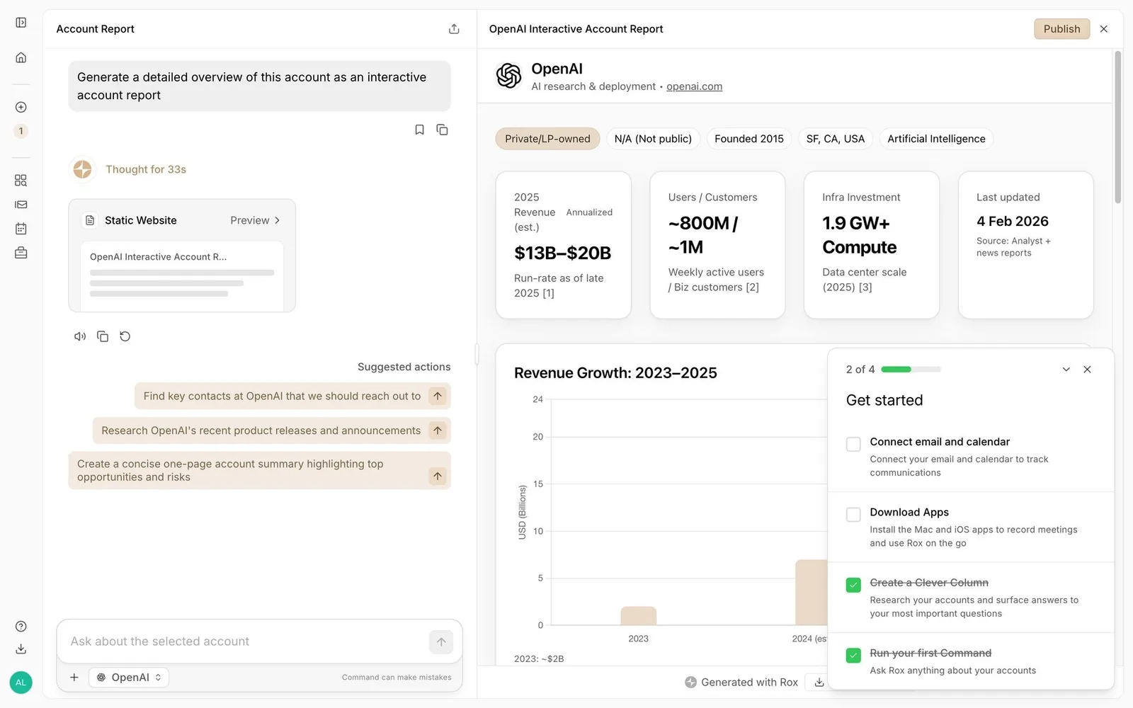
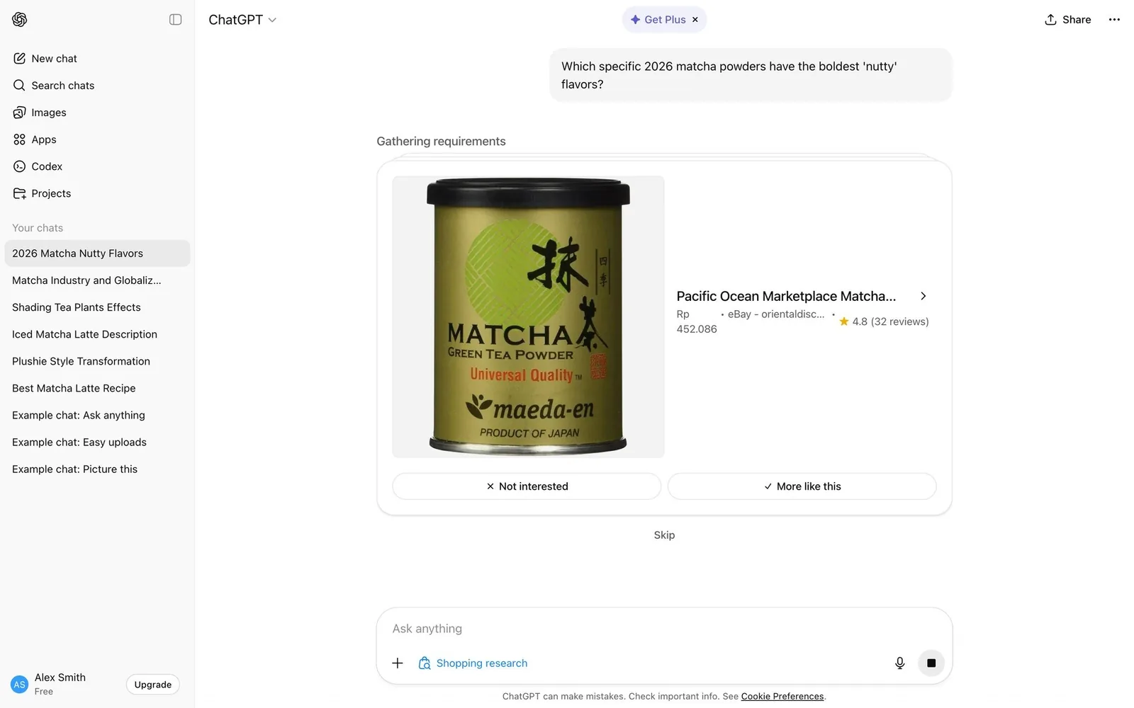
For your design system. This is the pattern that should keep design system teams up at night, in a good way. When the model picks which component to render, your components become the model's vocabulary. Clear names, clear props and written usage rules decide whether the agent renders your Card correctly or invents something. OpenAI's Apps SDK guidelines are worth reading for exactly this reason: they're a design system written for a model.
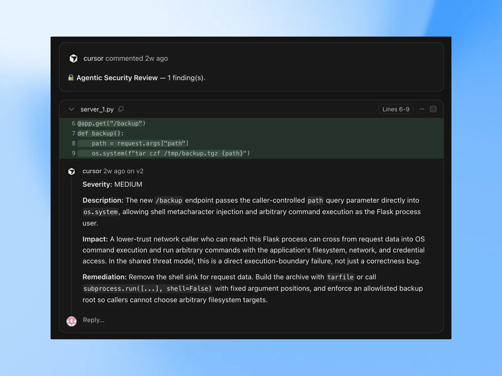
30. Per-hunk diff review: Keep / Undo / Apply
Agent edits land as reviewable diffs. Accept or reject each hunk, step through “1 of 5”, then “Apply changes to main”. AI review bots also comment on PRs.
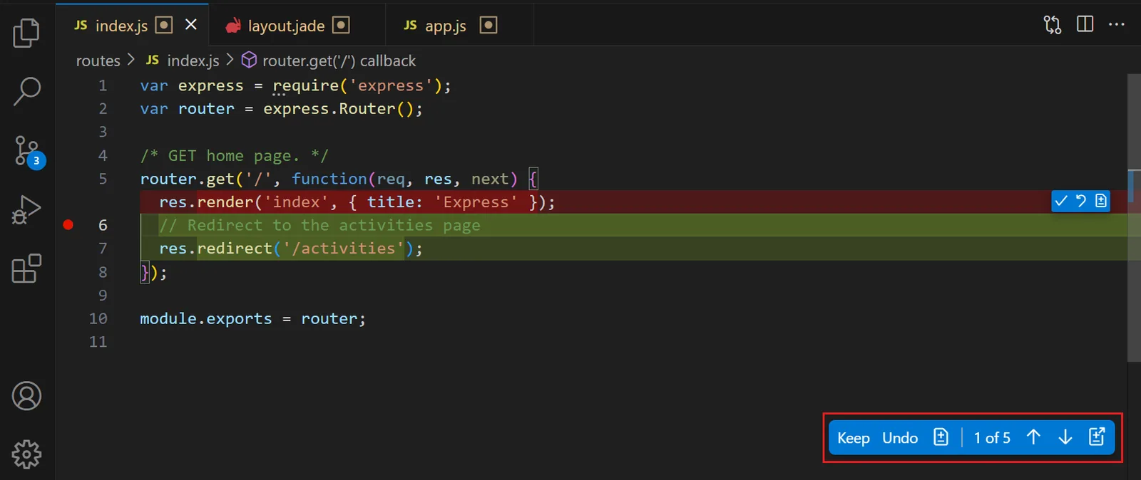
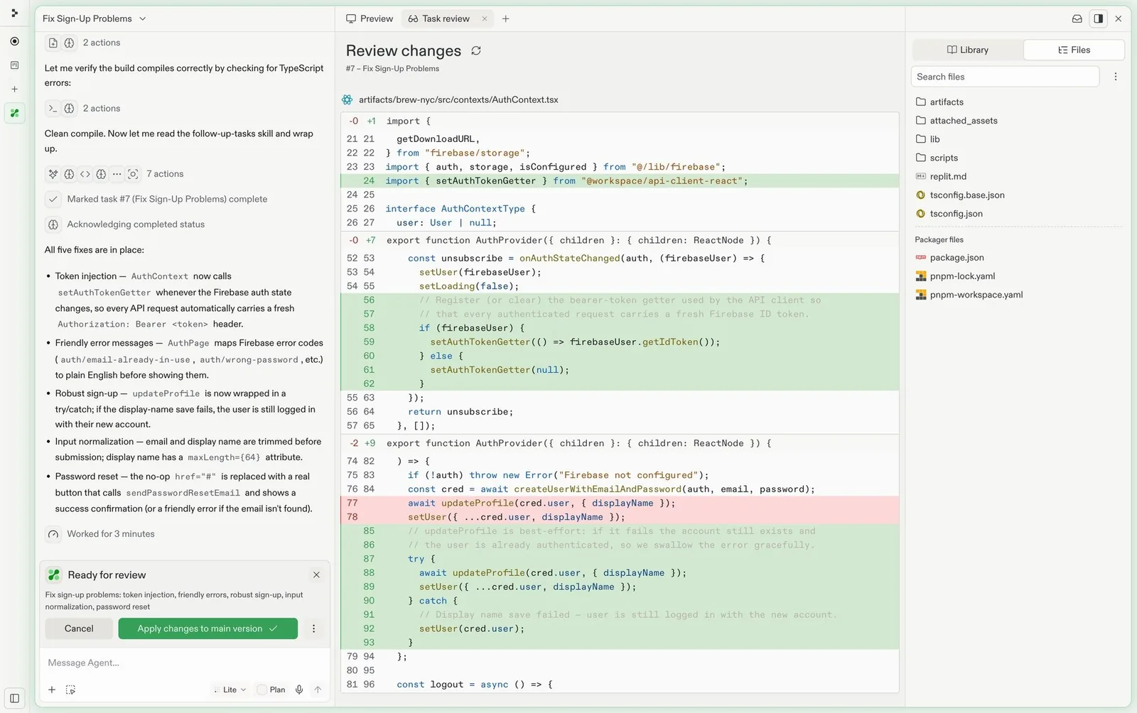
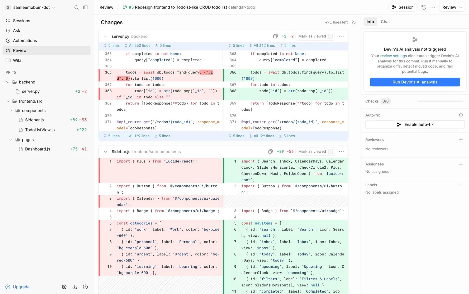
For your design system. Diffs used to be a developer thing. Now they show up in docs, slides and design tools too: the AI changed this paragraph, keep it or undo it. Added and removed colors are a good candidate for semantic tokens (
color.diff.added,color.diff.removed) if you don't have them yet.
31. Checkpoints and rollback
Every agent turn creates a restore point. You can roll back files, the database and even the agent's memory to an earlier step.
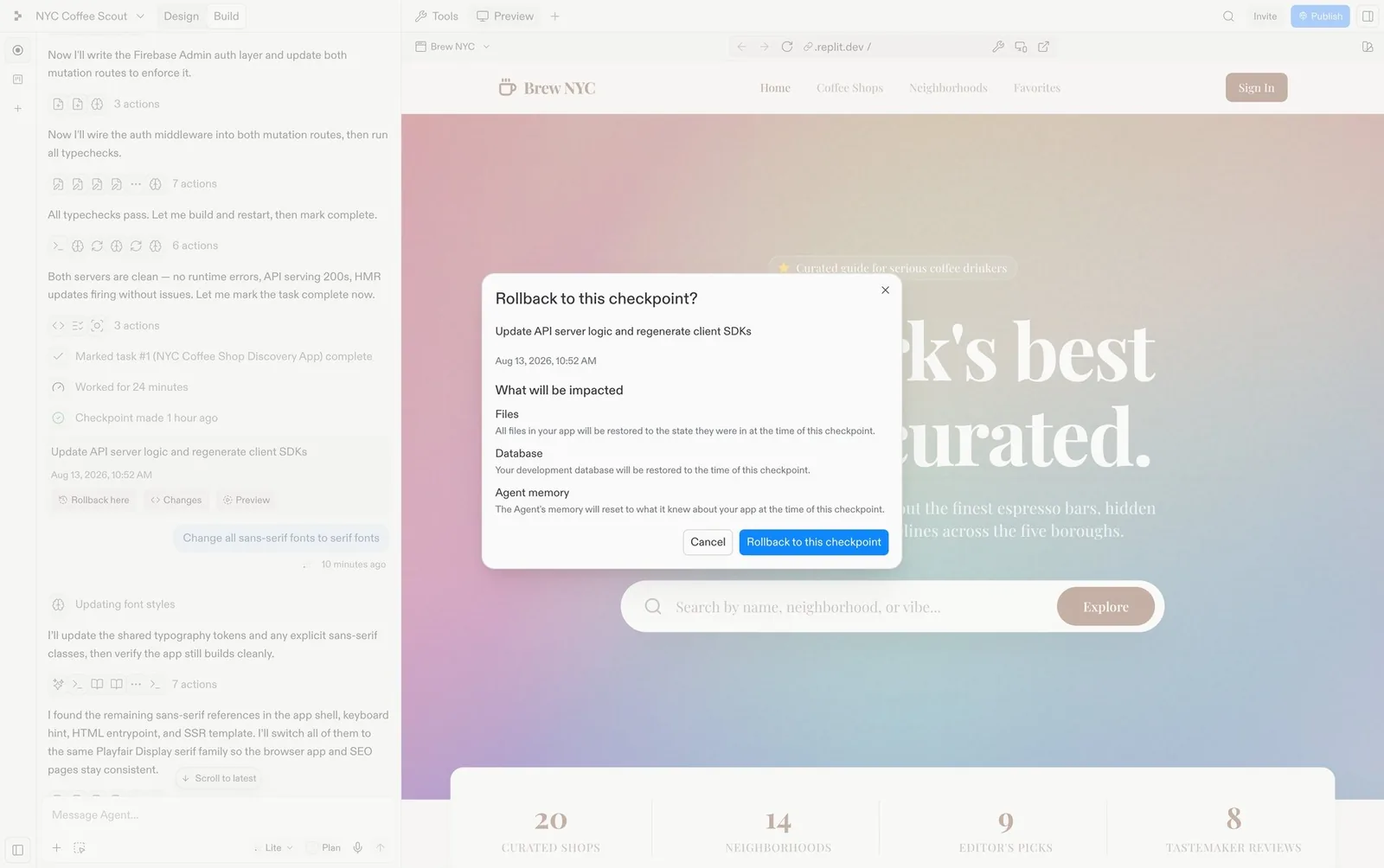
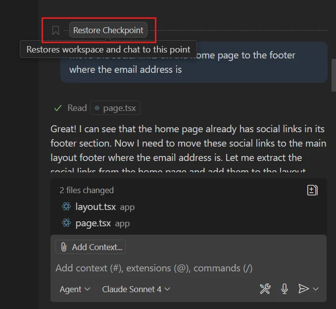
For your design system. Undo was always a safety net. With agents, it's the reason people dare to say "yes" to autonomy in the first place.
Memory, connectors and project instructions
Persistent context is now something users can see and edit: what the AI remembers, which tools it can reach, and the house rules files it reads.
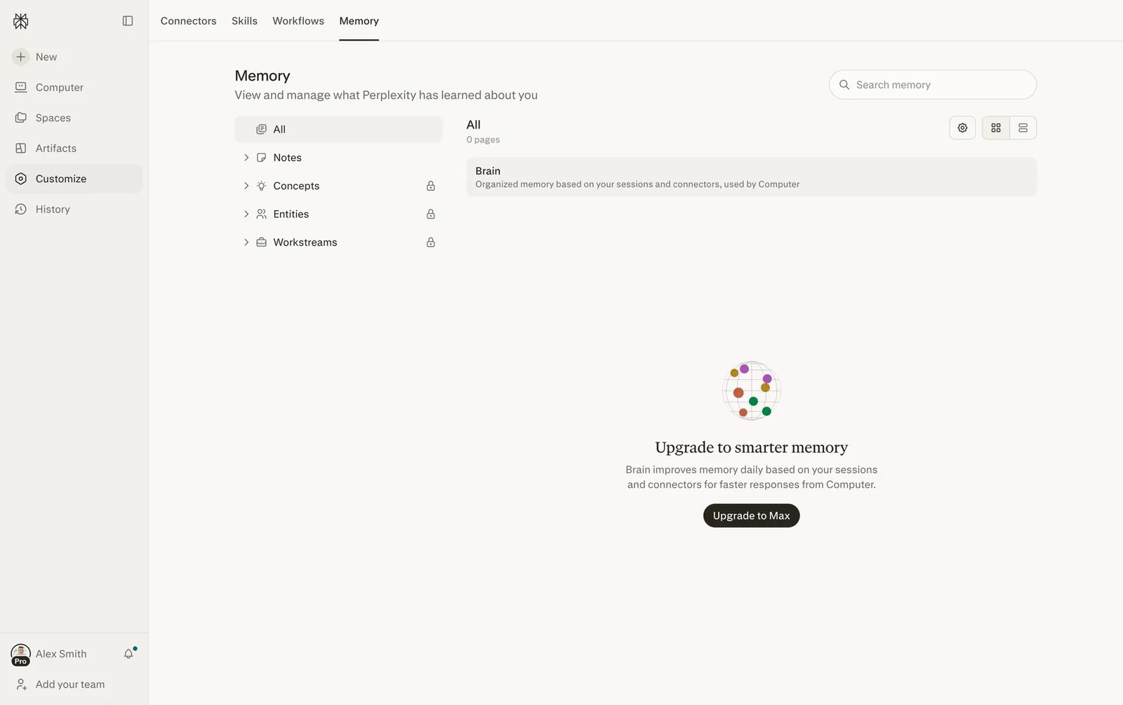
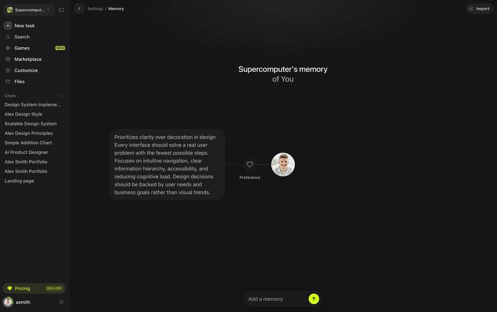
32. User-visible memory manager
A settings page listing what the assistant remembers about you (notes, concepts, entities), with the ability to edit or delete each item.
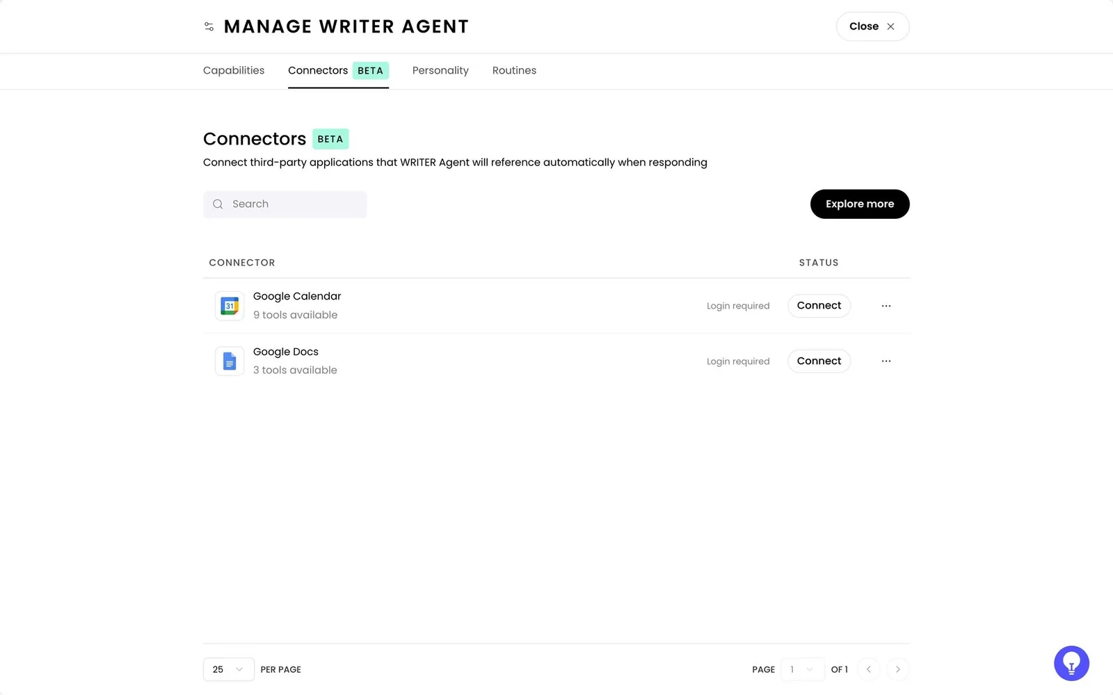
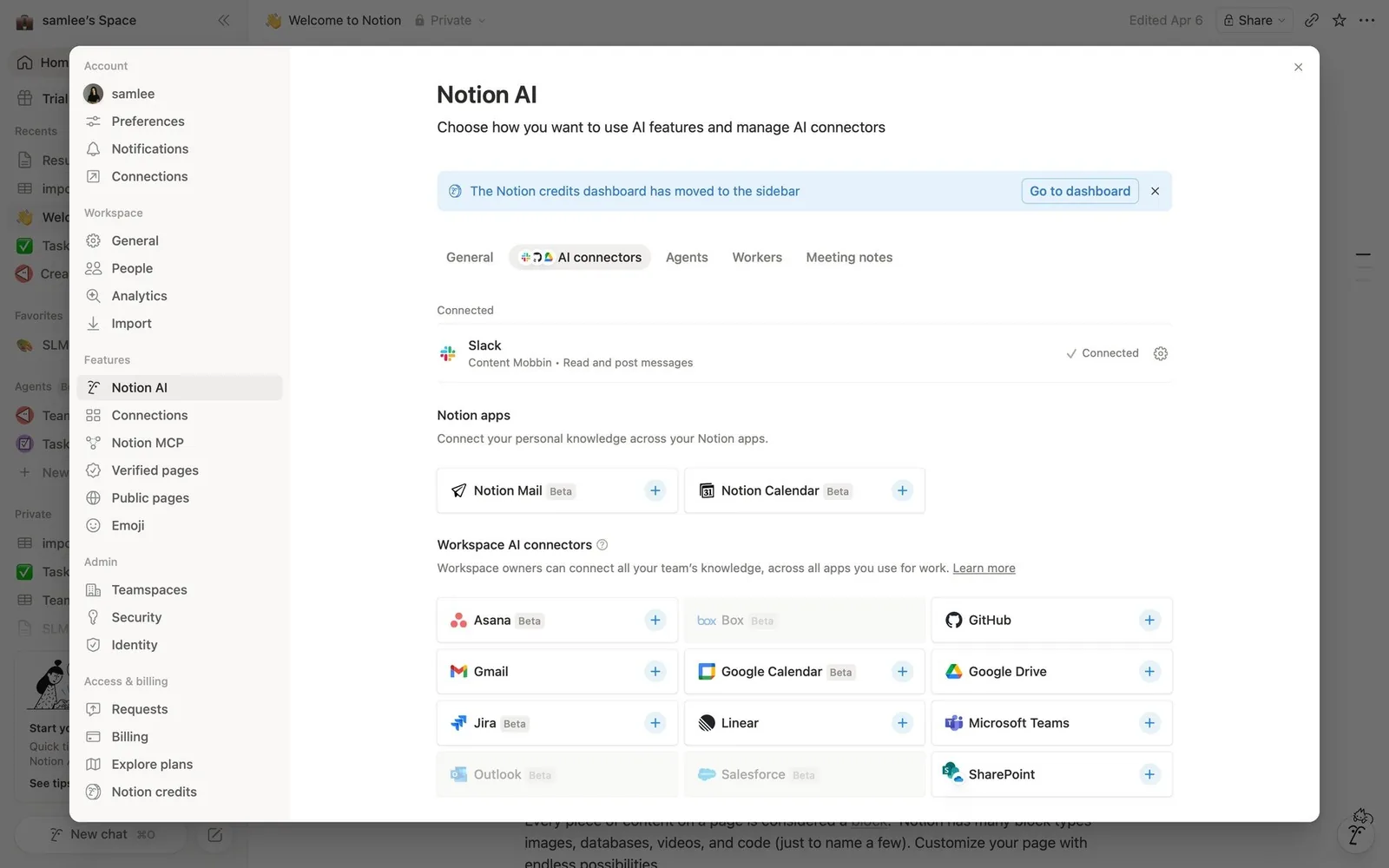
33. Connectors / MCP tool catalog
An app-store-like list of connected services and MCP servers, with tool counts (“9 tools available”) and per-tool toggles. Terminals show “2 MCP servers” in the footer.
34. Project instruction files (AGENTS.md / CLAUDE.md / GEMINI.md)
A markdown file in the repo acts as the agent's persistent brief. The UI shows which files are loaded (for example “Using: 2 GEMINI.md files”).
For your design system. This one is closest to home for design system teams. An AGENTS.md file is documentation that an agent reads before every task. If your usage guidelines live only in a Figma page or a Notion doc, the agent never sees them.
What's still missing
- No original screenshot of Claude Artifacts or ChatGPT Canvas. Canvas is illustrated with Langdock, Le Chat and Klaviyo instead.
- OpenAI Operator / ChatGPT agent takeover: openai.com blocks automated fetches, so takeover is illustrated with Manus. The openai.com links are cited but could not be machine-checked (HTTP 403 to bots).
- Ambient/proactive agents (agents that act unprompted, e.g. inbox triage suggestions) and agent-to-agent handoff between vendors: no strong visual found beyond Warp's harness picker.
- Aider and Cline: no usable raster screenshot (Aider uses an SVG screencast).
Screenshot sources
Most screenshots come from Mobbin, a library of real app screens. The rest come from official product docs and READMEs on code.visualstudio.com, code.claude.com, github.com, warp.dev, manus.im, help.manus.im, developers.openai.com and cursor.com. Pattern framework: The Shape of AI.